Saucy! By KFC
Be Bold. Stay Saucy.
Platform
App, Web, Kiosk, Drive-Thru
Role
Lead UX/UI Designer
Timeline
Jul 2024 - Aug 2025
Team
Senior Designer, Design Support, UX Research, Brand Stakeholders, Engineering, Marketing, Loyalty Partner
Established a multi-surface design system, flows, animation and microinteractions for Saucy (a bold, sauce-forward restaurant that reimagines KFC’s core offering through customization and flavor exploration). The experience prioritizes discovery, speed, and digital-first ordering across kiosks, mobile, and drive-thru.
Goal
Capture the Gen Z audience that traditional QSR had failed to excite
With a user friendly, scalable experience leveraging KFC’s existing infrastructure.
Less taps to purchase
Support fast decision-making in quick-service contexts. Users should be able to order in as little as 2 taps and adapt to users’ needs.
Not just another quick service restaurant
Needs to feel immediately recognizable as Saucy not traditional KFC.
Scale consistently across platforms
Express Saucy’s vibrant visual identity while maintaining usability, accessibility, and performance across multiple environments with differing constraints.
My role
Ownership from ideation to handoff
Creative Direction and Consistency
I established foundational principals for the UI and animation/interaction states. From there I built the omnichannel design system with component documentation that was handed off for an international development team.
Through the project duration I provided designers with feedback across app, kiosk, and drive thru surfaces while maintaining visual and systems consistency across all deliverables.
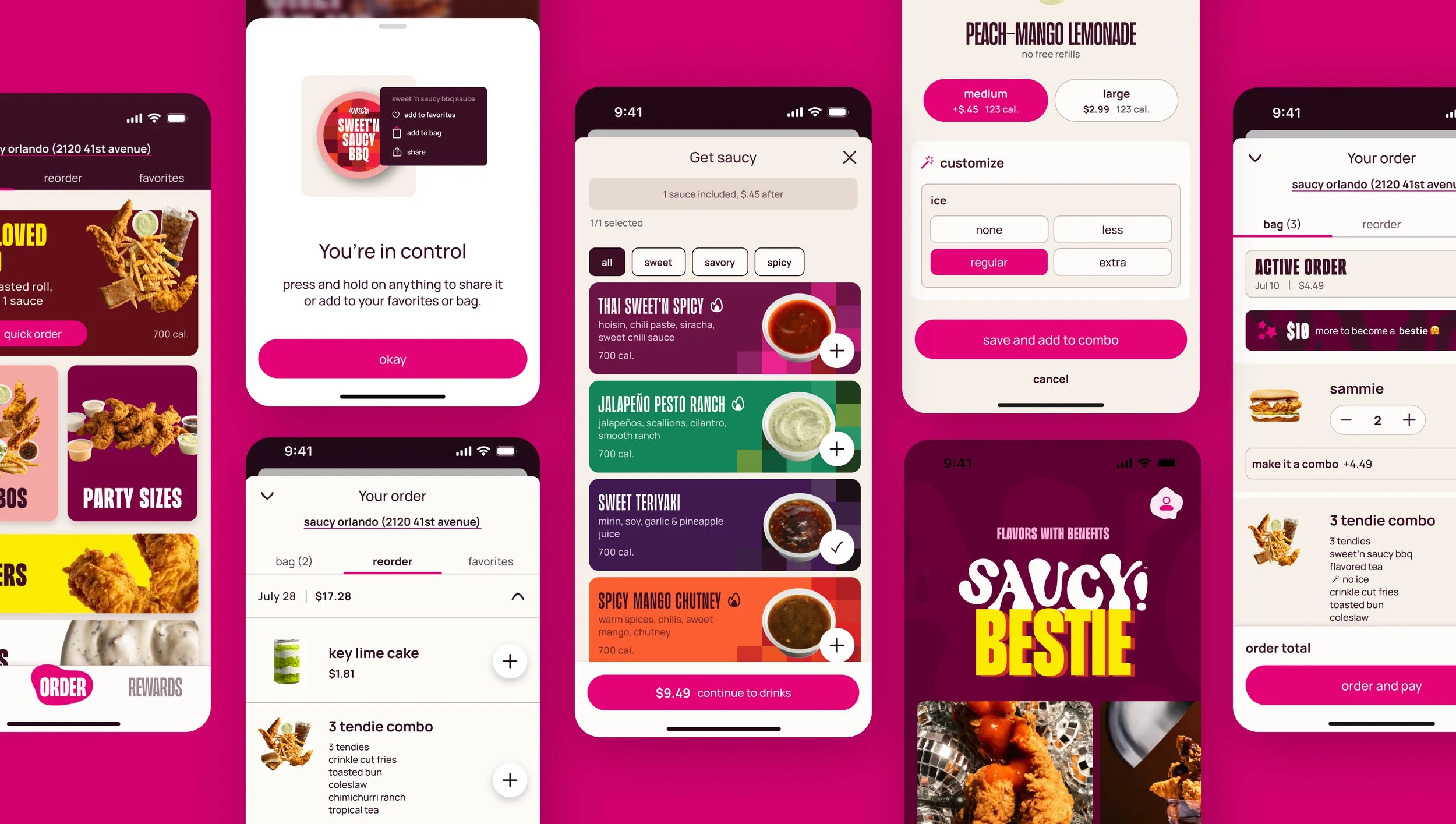
Simplified Ordering
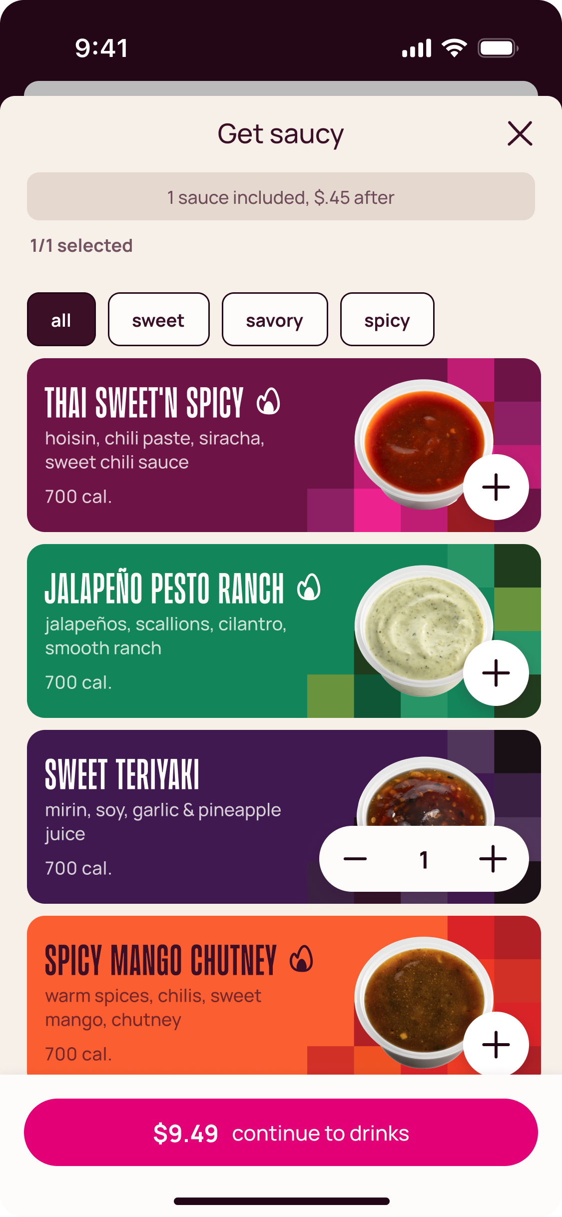
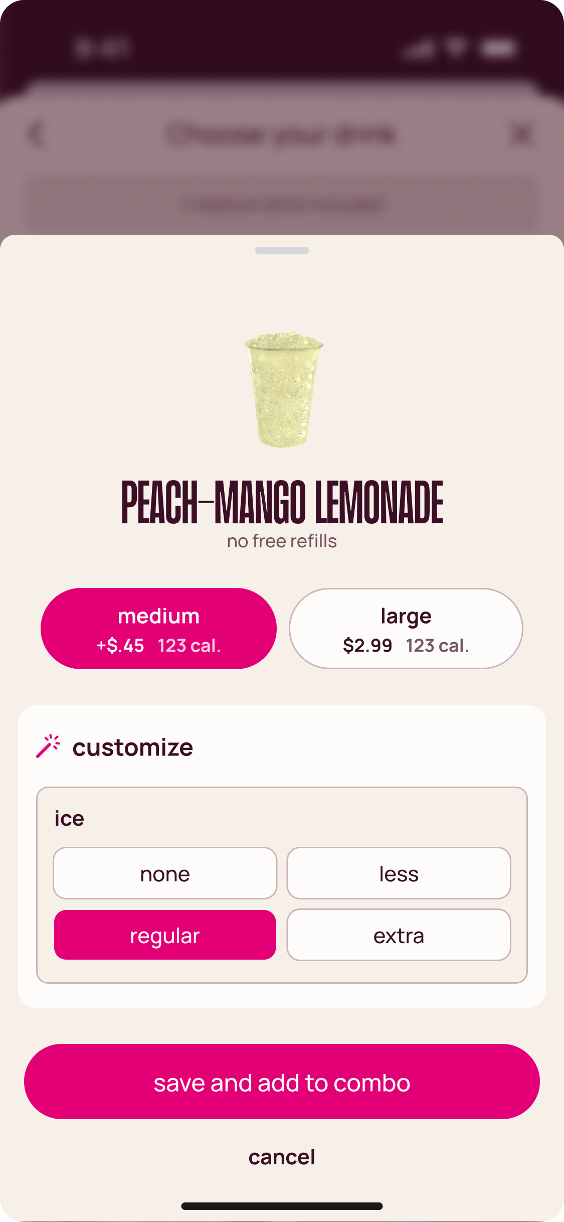
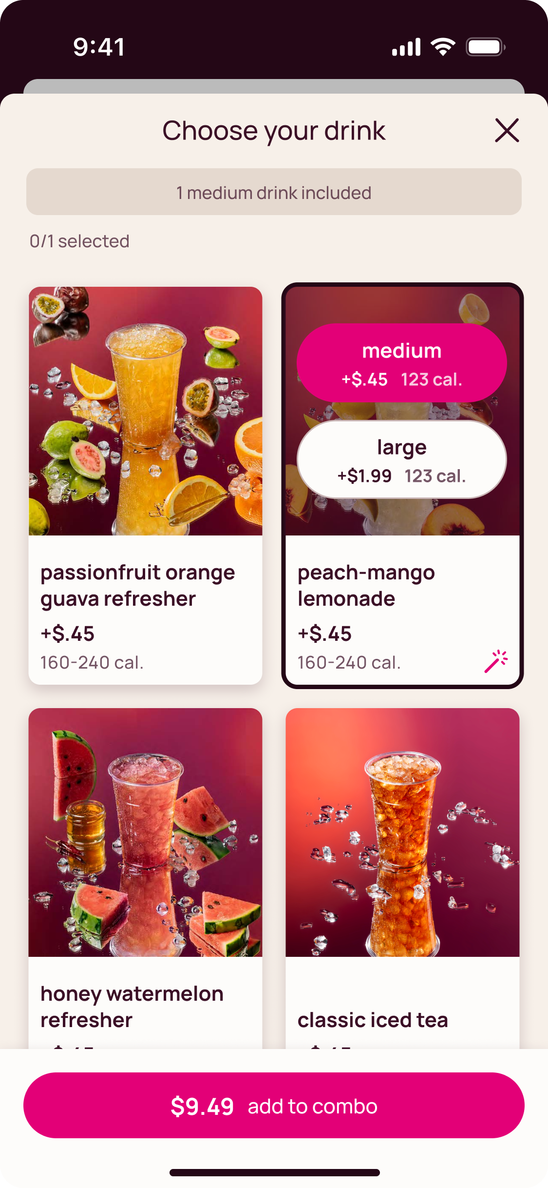
Designed multi-surface sauce and combo selection flows that balanced high customization with low cognitive load across app, kiosk, and web.
Post Purchase
Built a post-purchase engagement system with contextual home screen content, quick reorder, promotions and Live Activities to reduce time-to-checkout for repeat users.
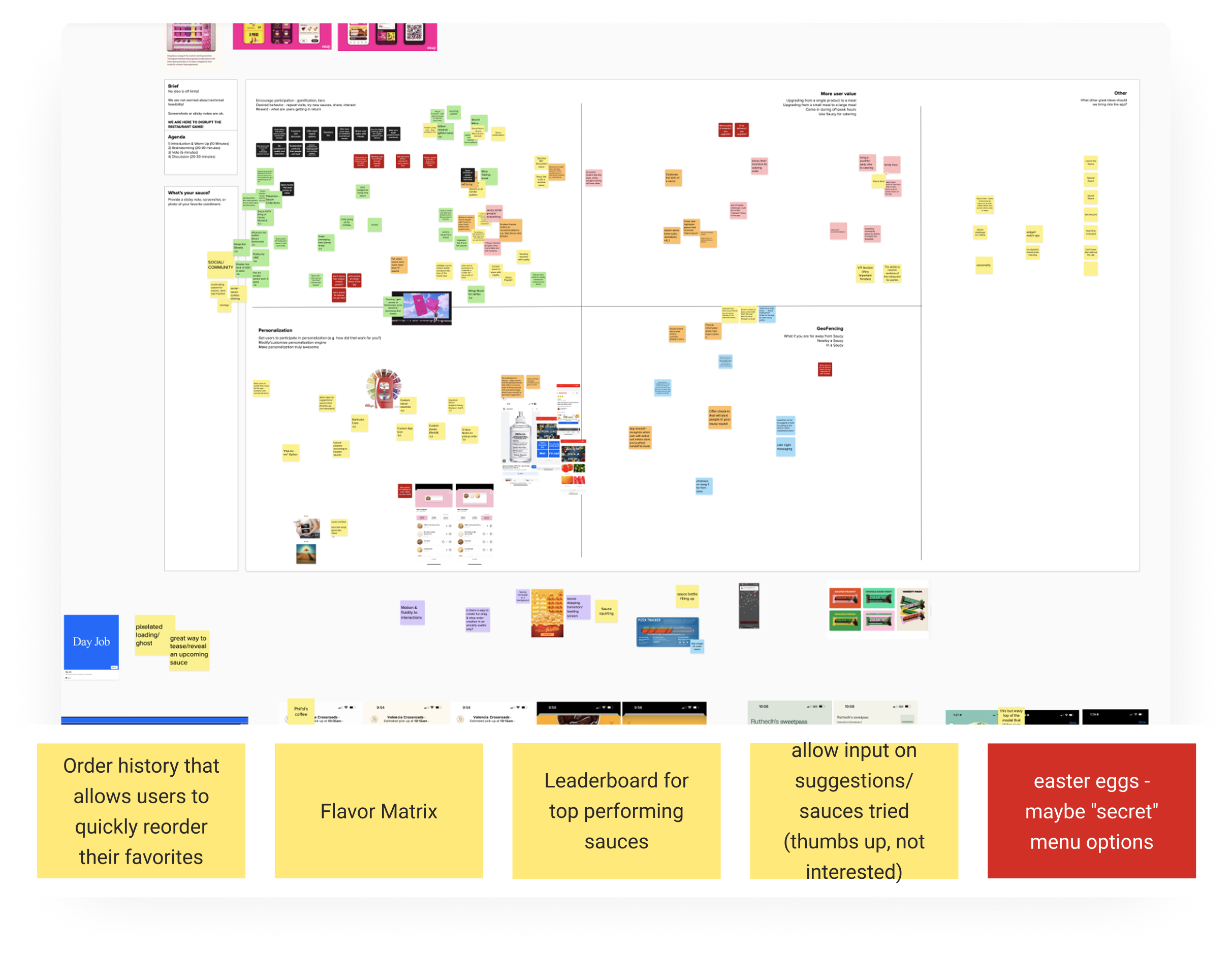
Research
To understand the task, our team completed a full landscape analysis of QSR apps. UX Research audited competitors to understand where we could differentiate and ran a heuristic analysis to identify the mistakes other apps had made so we could avoid them. This informed everything from navigation decisions to how we thought about the tab bar.
Workshops allowed everyone to feel heard. With 25+ stakeholders across 9 teams, alignment wasn't a one-time meeting it was an ongoing practice.
Creative Direction
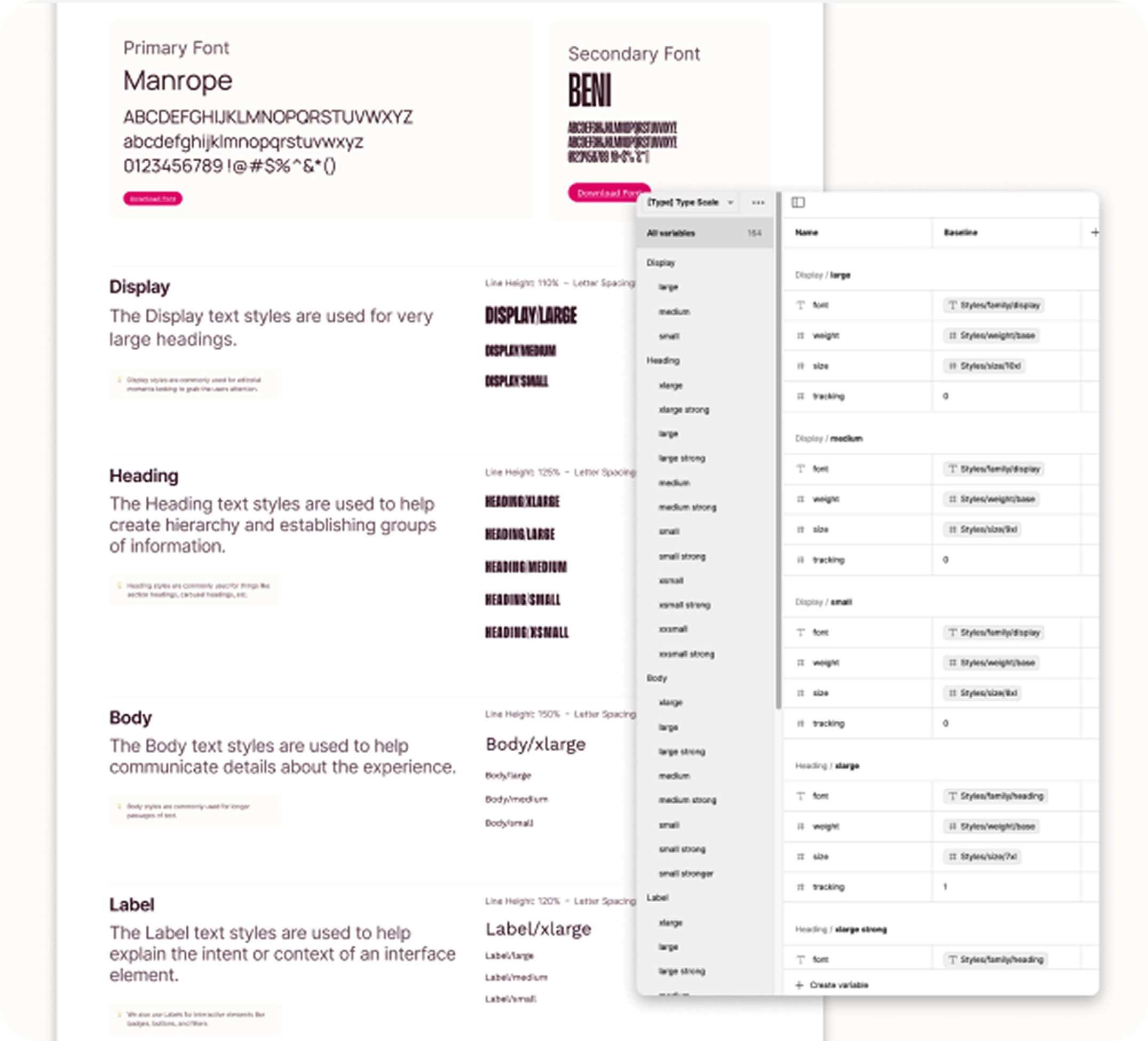
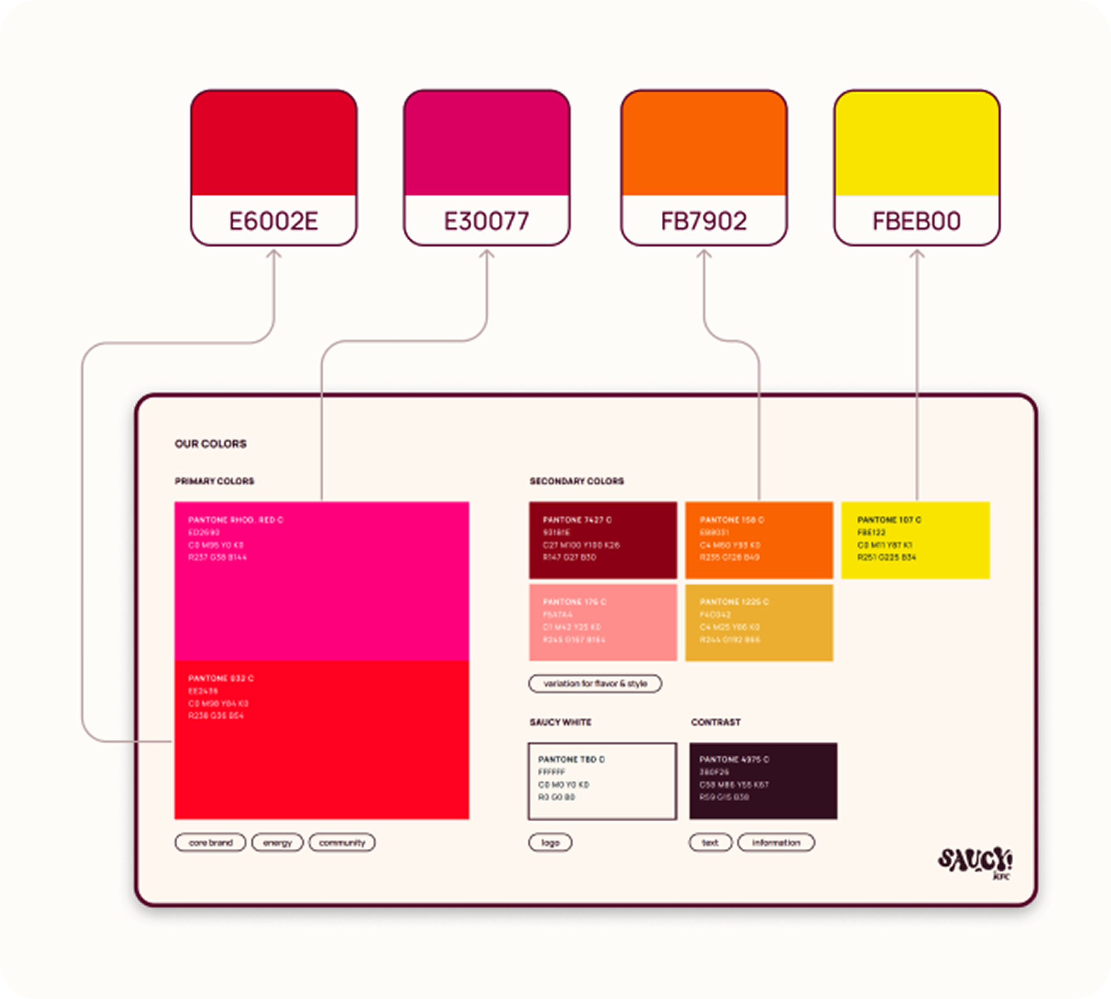
Saucy’s vibrant brand language had to be translated into a scalable design system that could be deployed across all digital touchpoints. This foundational system enabled Saucy’s bold brand energy to be employed consistently without sacrificing usability or clarity.
I mapped core brand colors to WCAG-compliant accessibility values and expanded the palette to support light and dark themes.
Defined hierarchical typography using a Major Second scale (1.125) for consistency across devices.
Established rules for elevation, spacing, icons, and interaction states to ensure a unified look and feel.

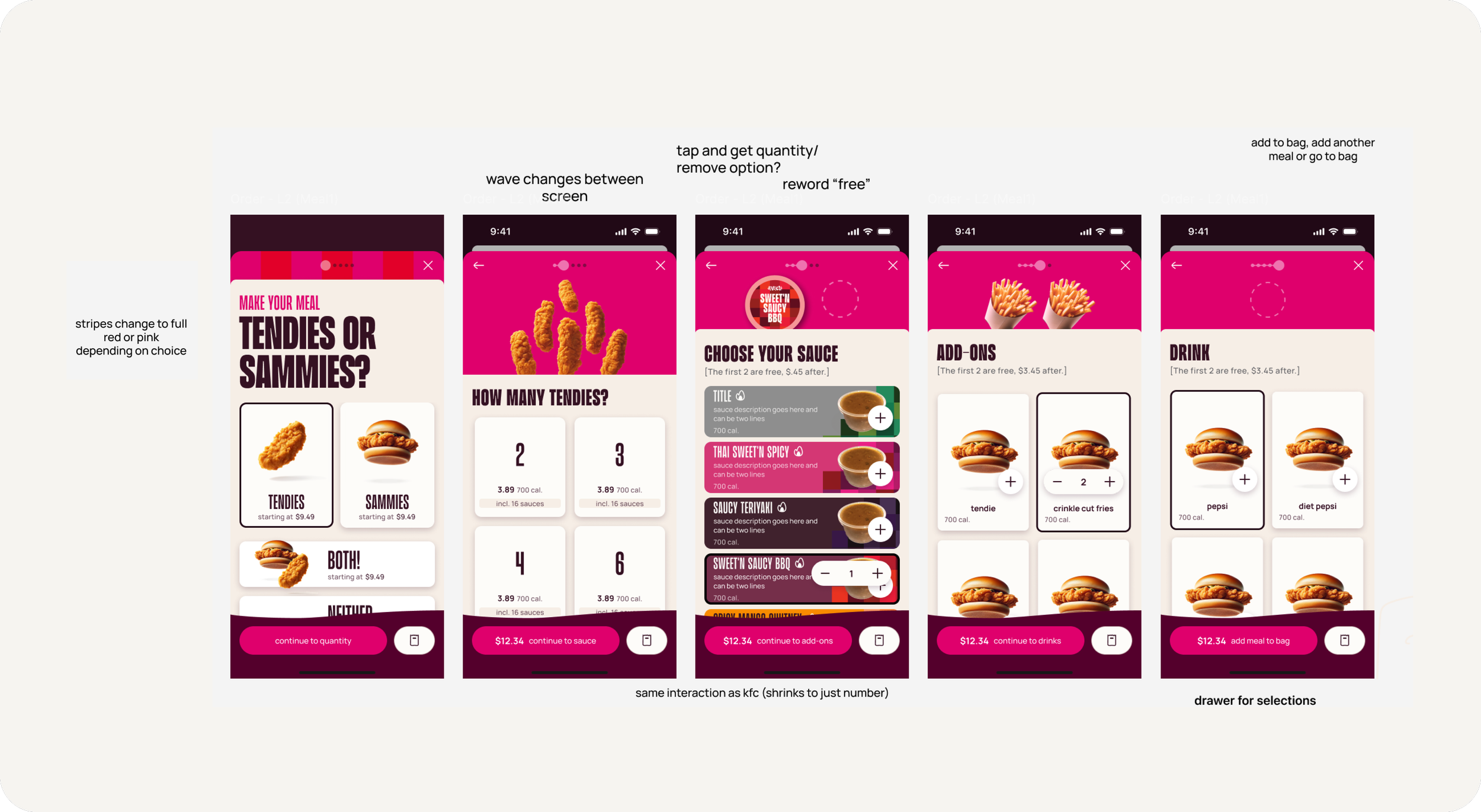
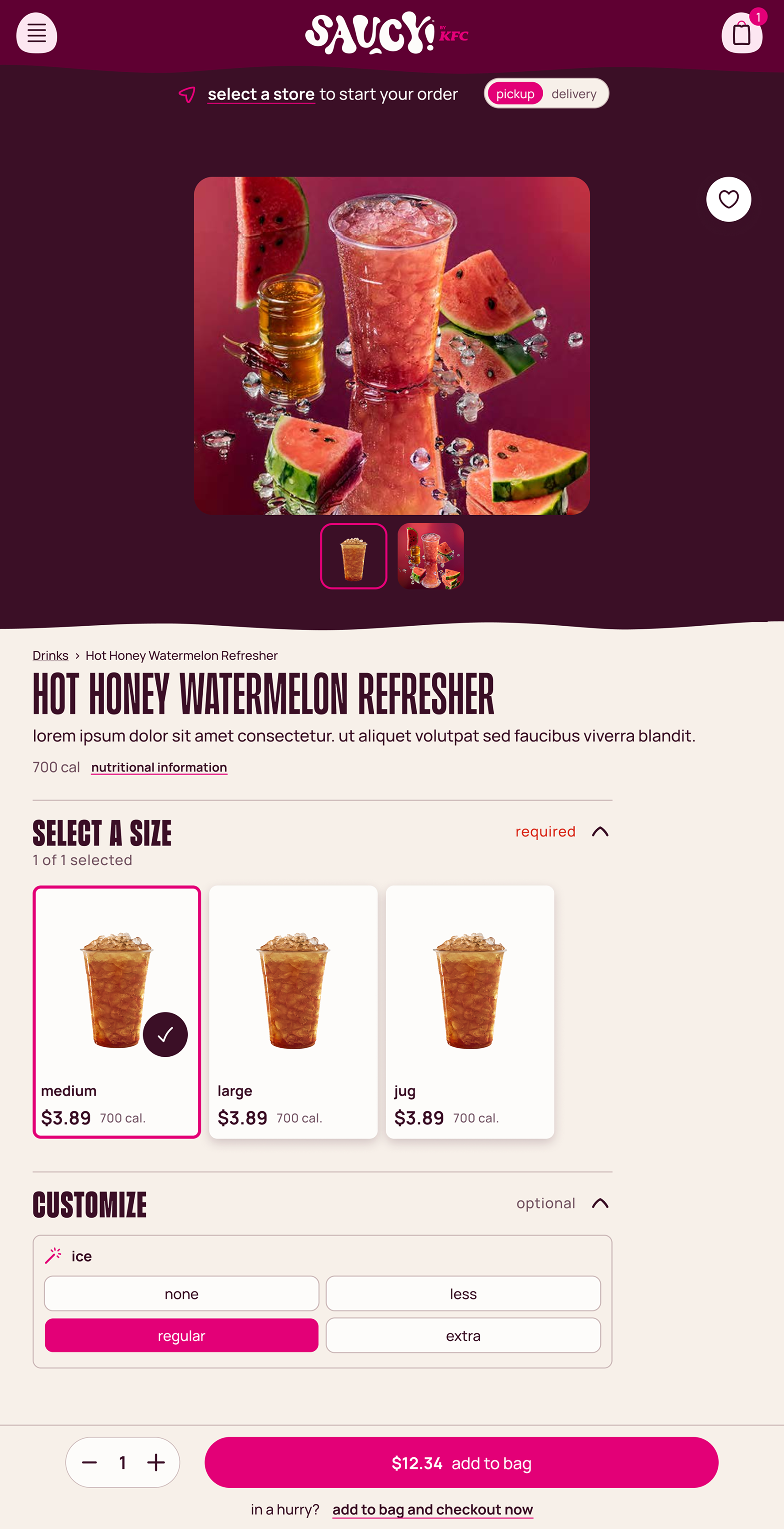
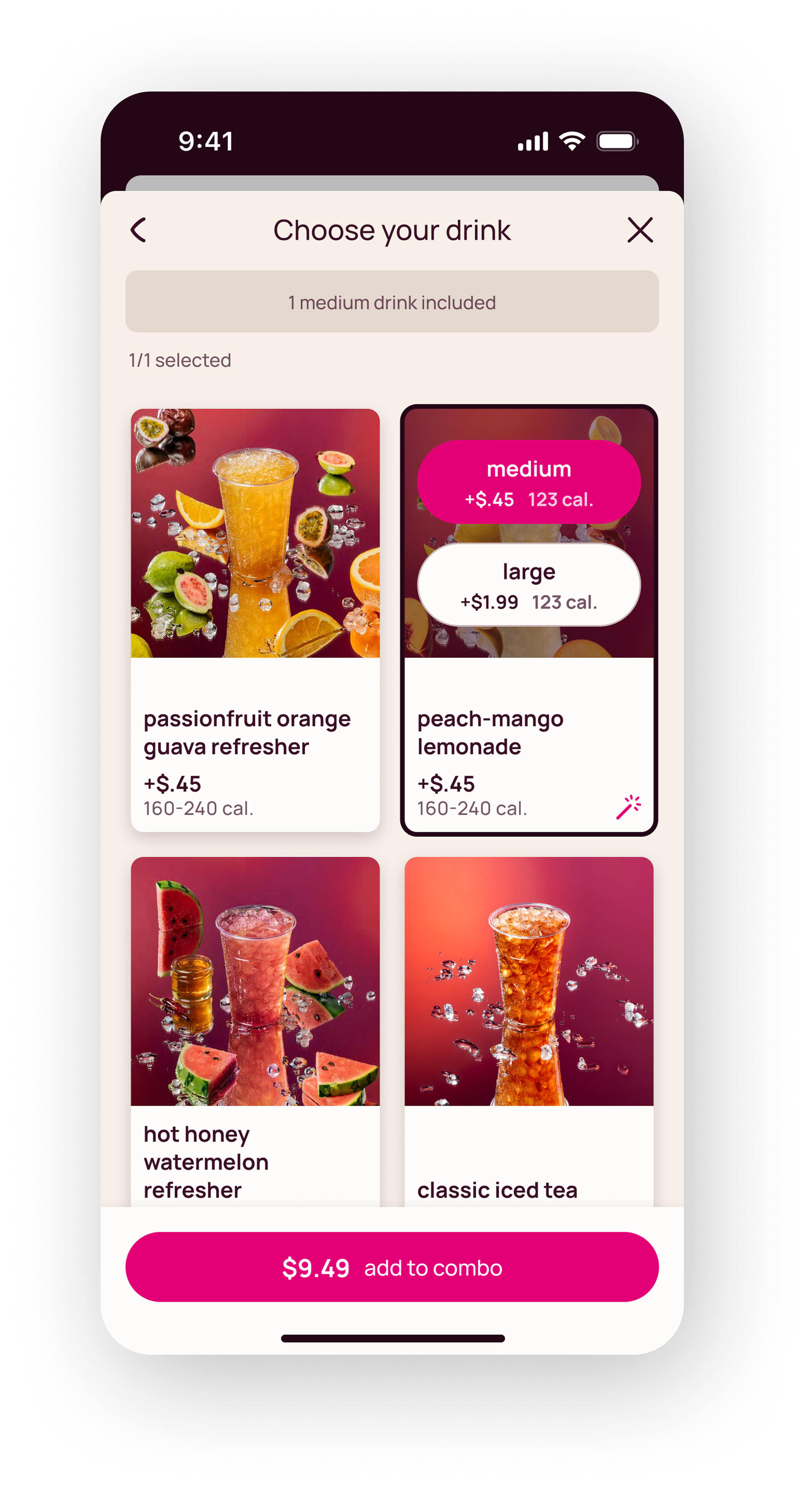
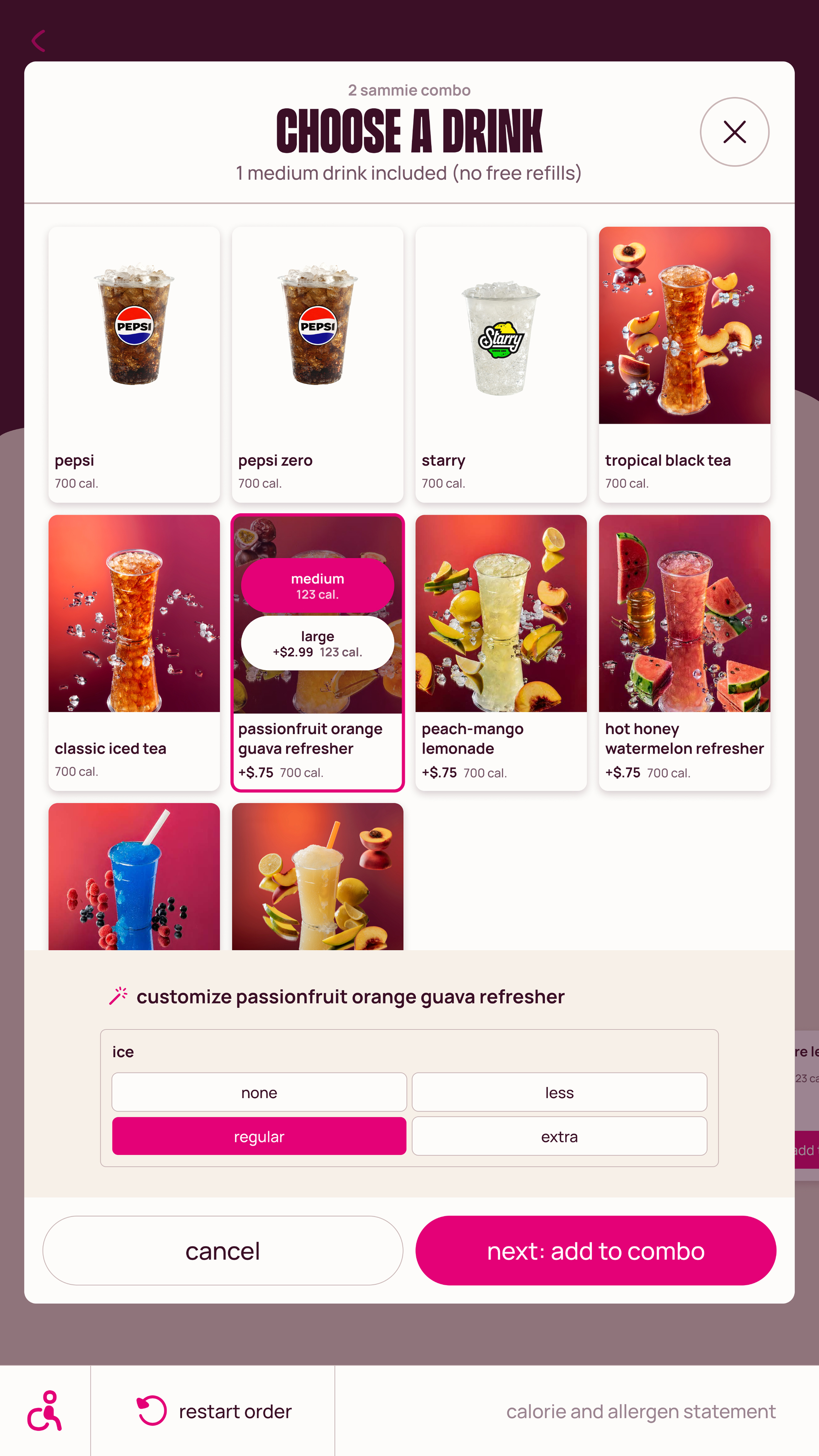
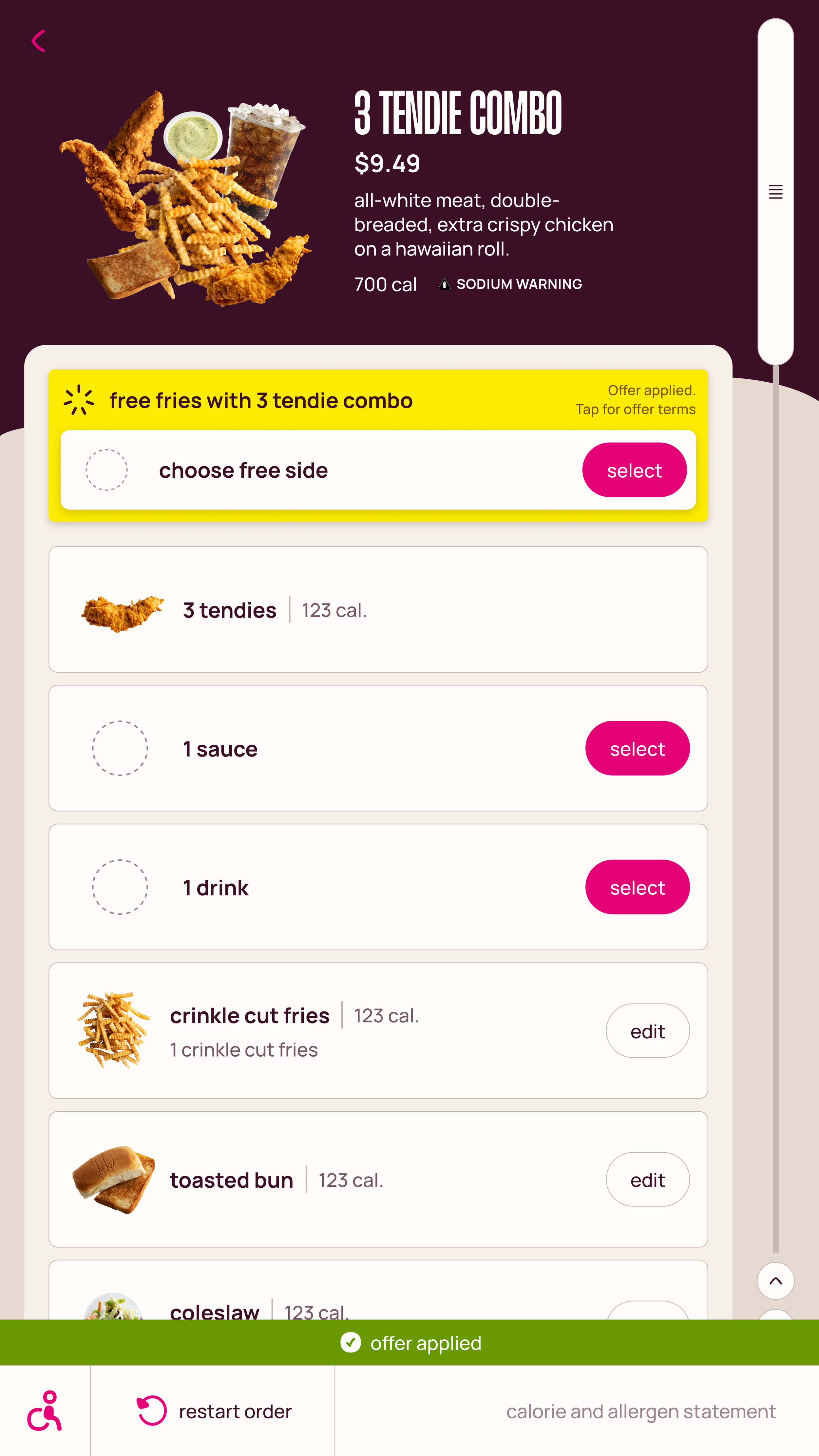
Simplified Ordering
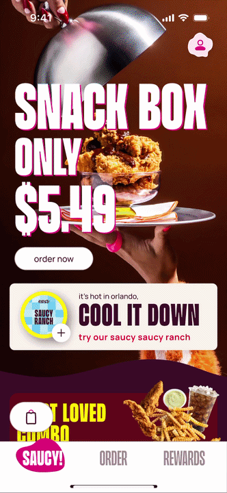
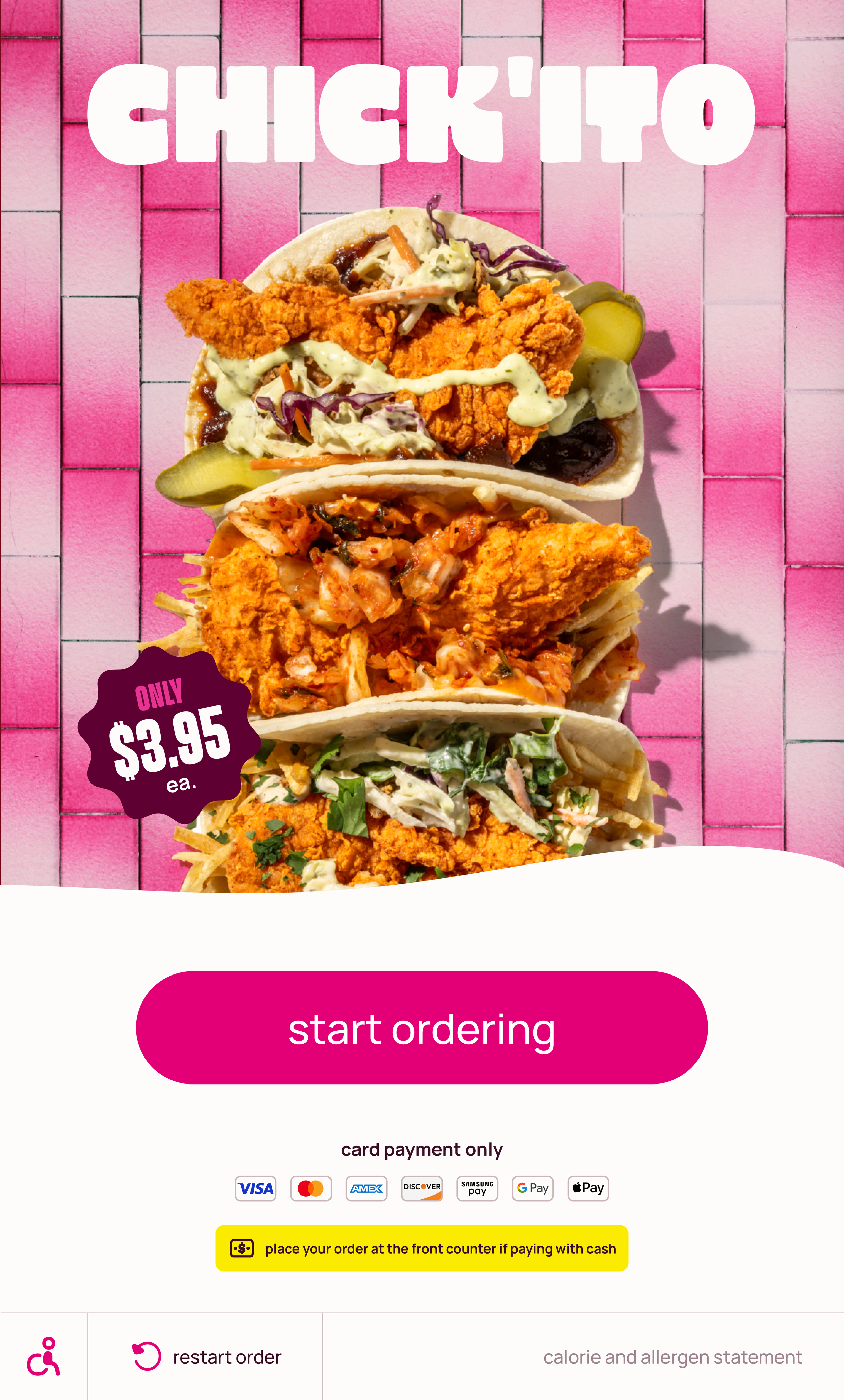
The ordering flow was designed around speed and confidence, though it was important for it to feel uniquely Saucy. Starting at the Saucy! (Home) tab highlights featured products and allows for personalization.
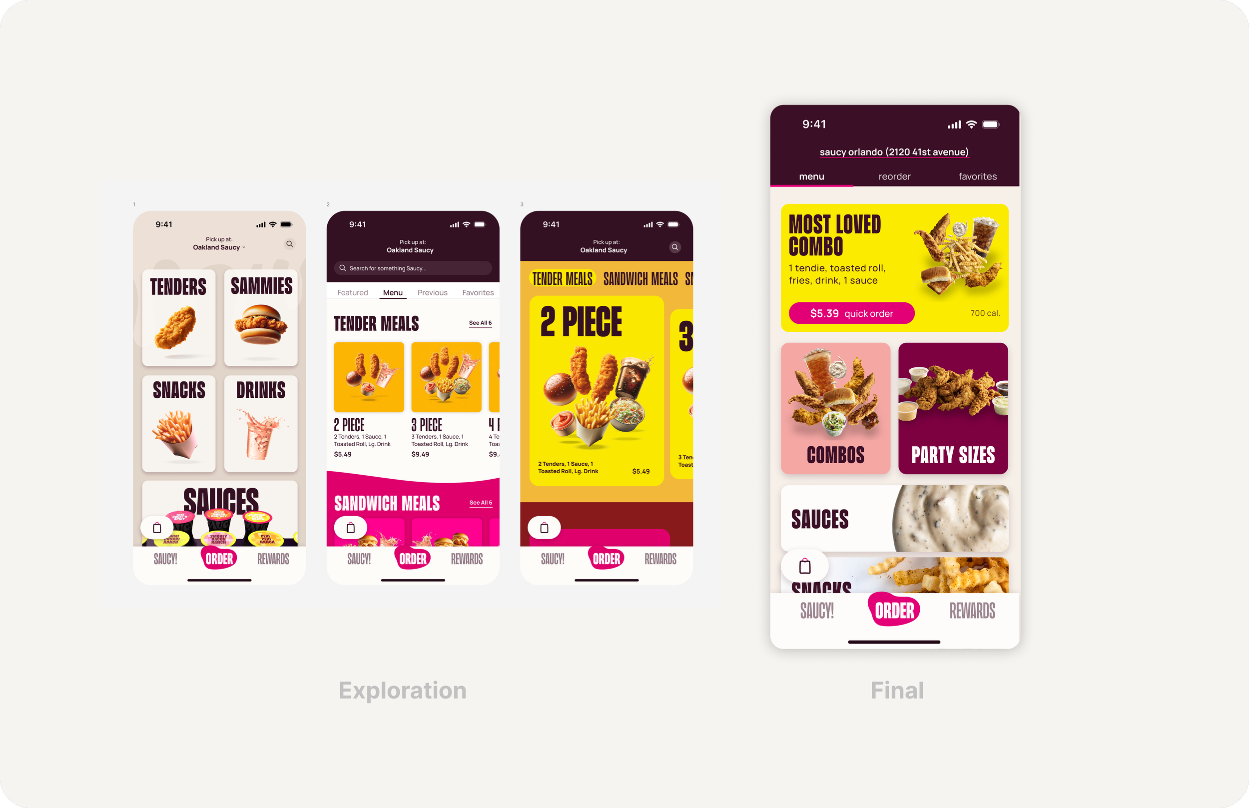
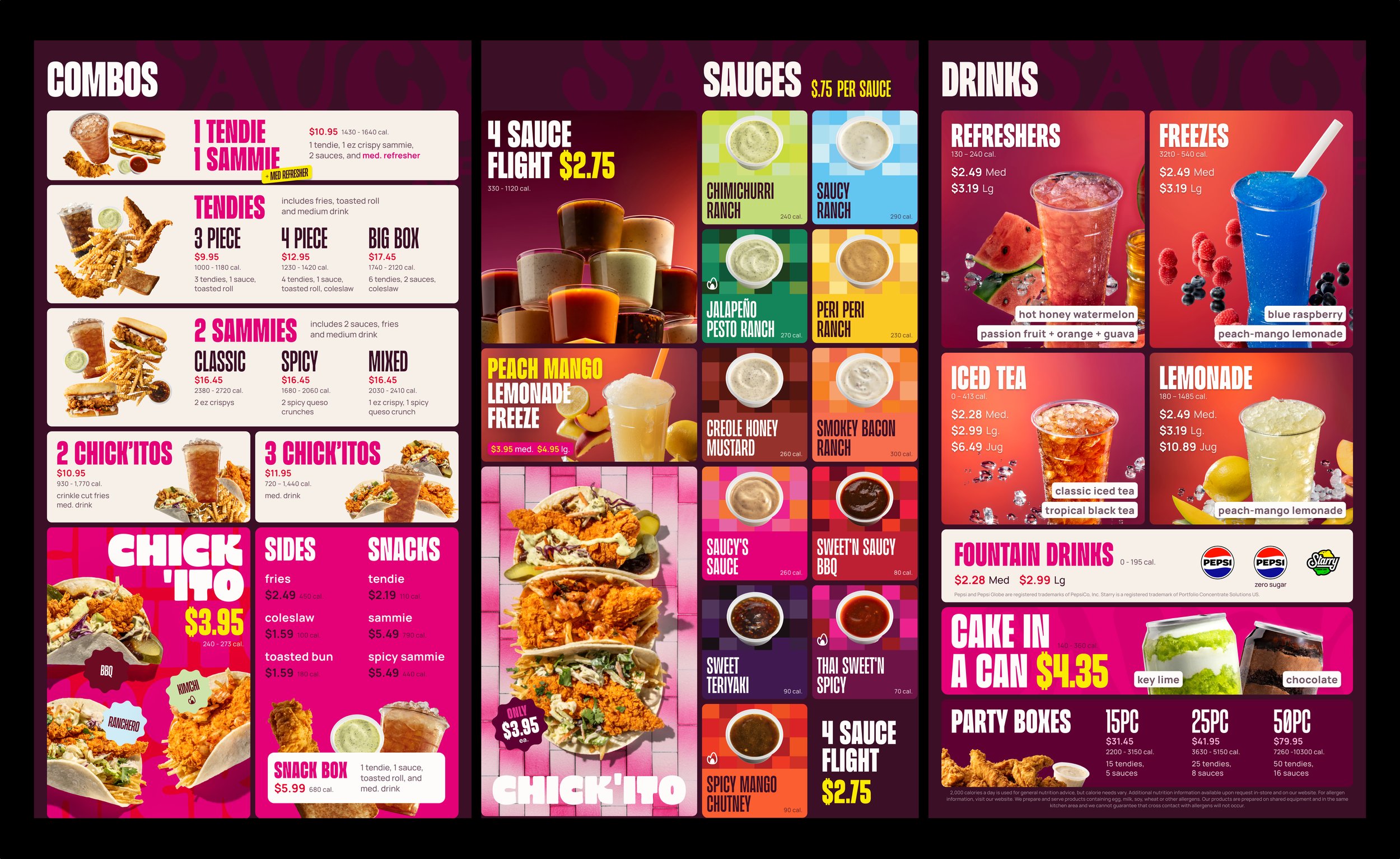
A Large, visually driven menu on the Order tab allows users to quickly scan and determine the best path forward.
Early exploration for A Make Your Own Combo flow.
What started as an exercise in simplifying the ordering flow actually made it more difficult for users to complete their orders.
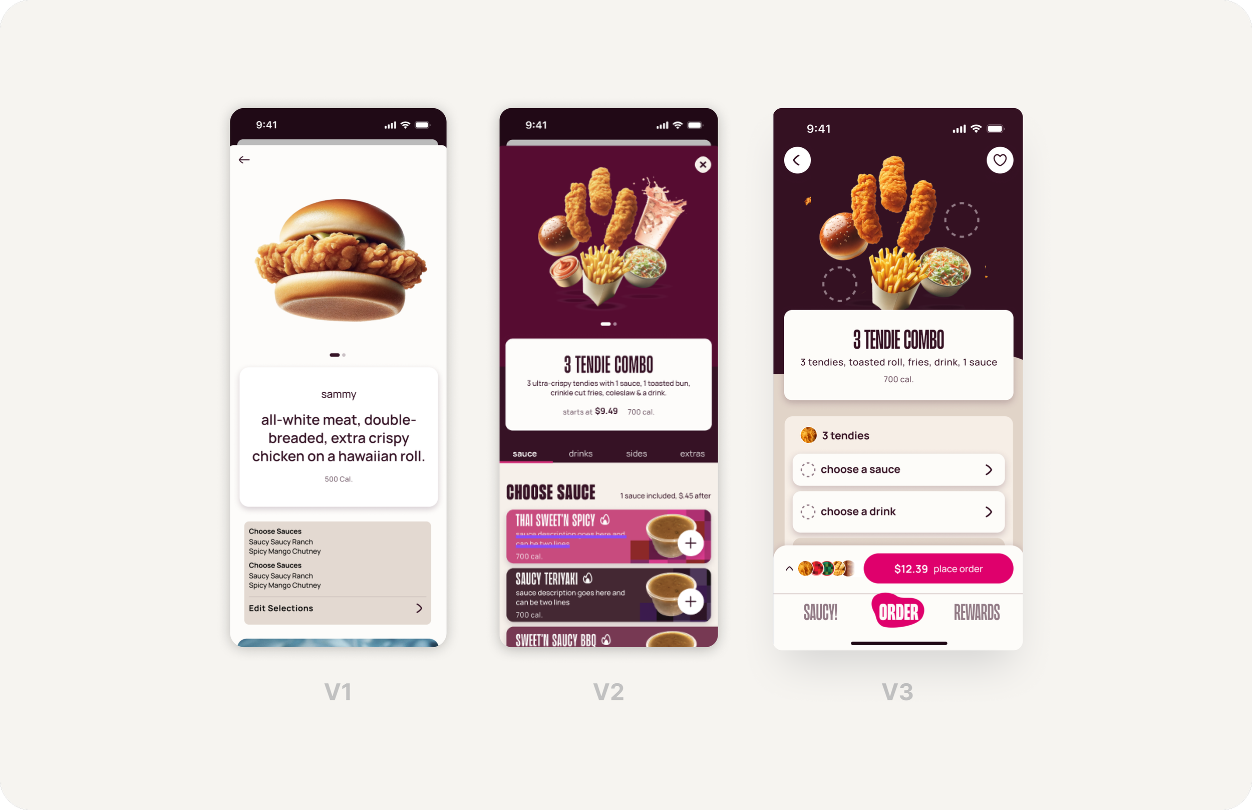
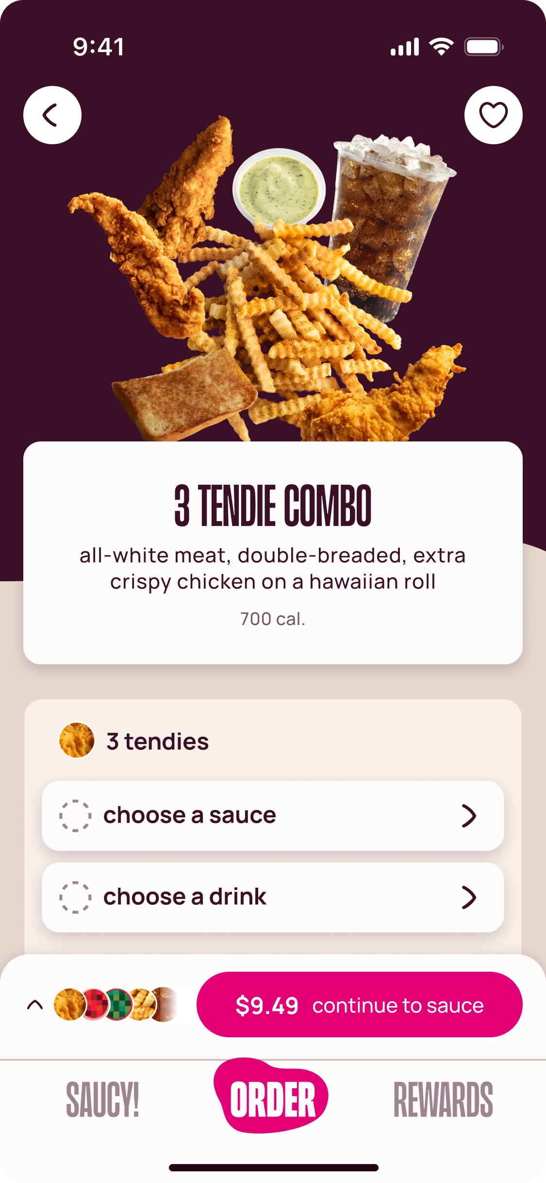
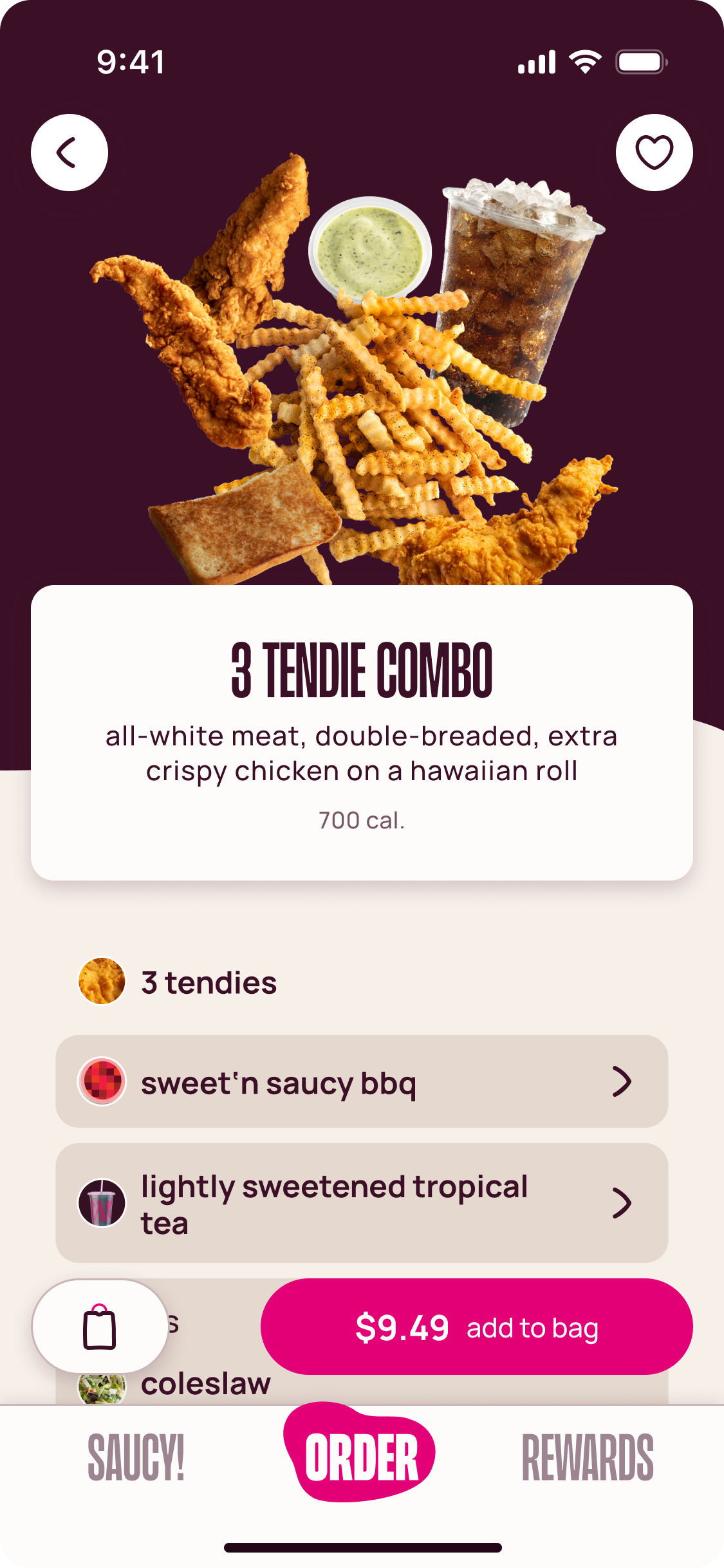
The product detail page went through a few iterations and refinements before landing on v3, which was designed to feel like a luxury retail experience. Default side selections give users less decisions to make.
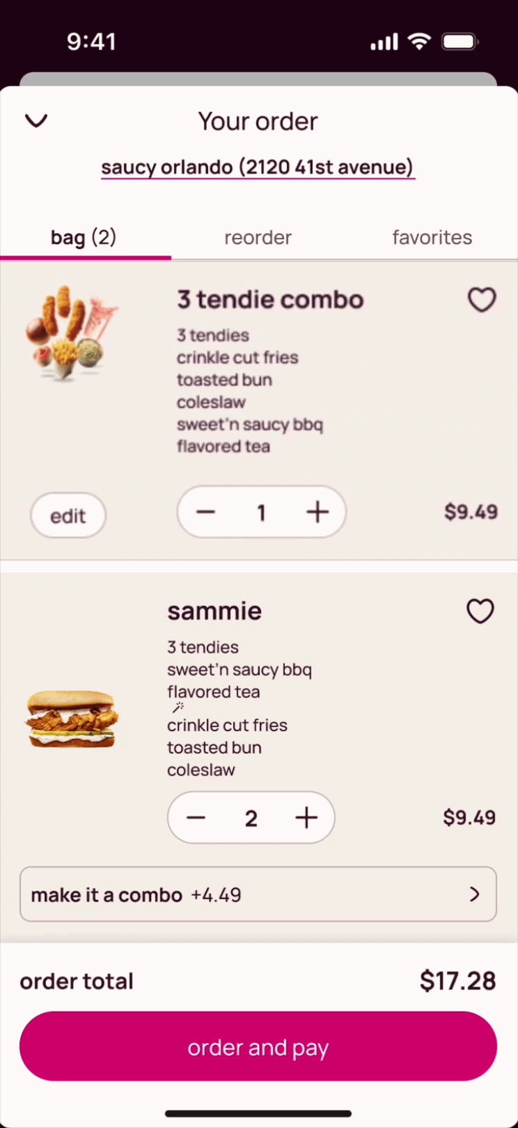
Happy Path Sample
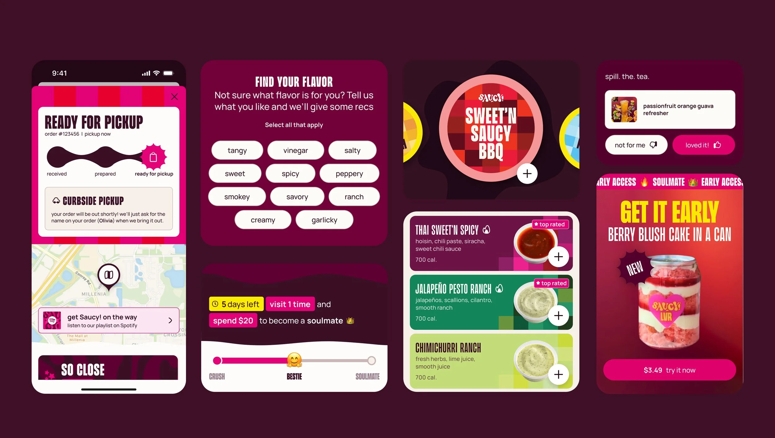
Post-Purchase
Convenience
App content changes as users engage with it, creating shortcuts to ordering and reducing friction to purchase.
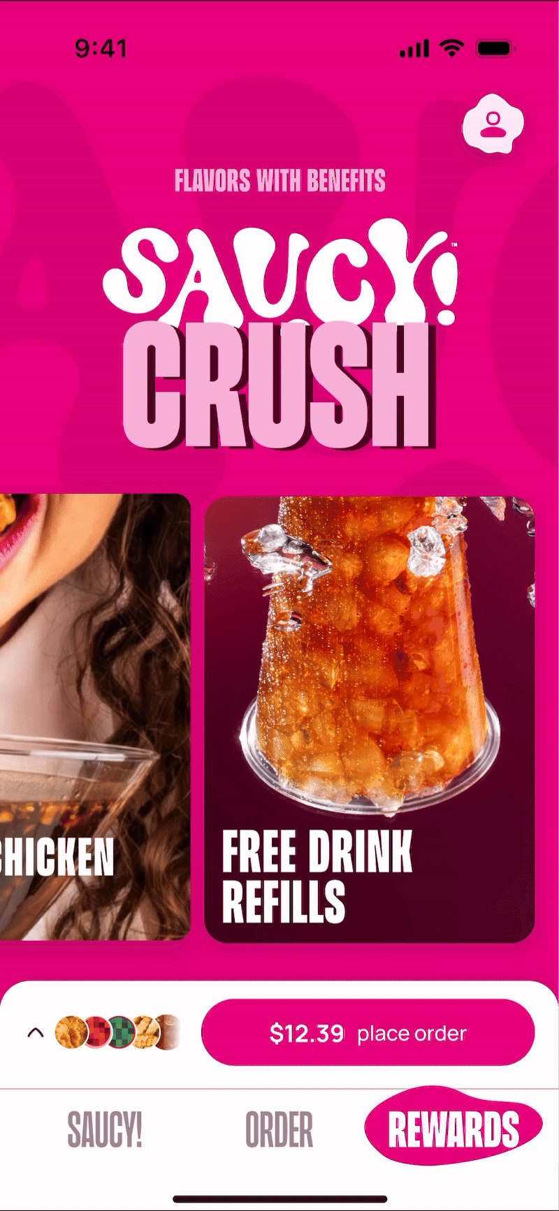
Incentive
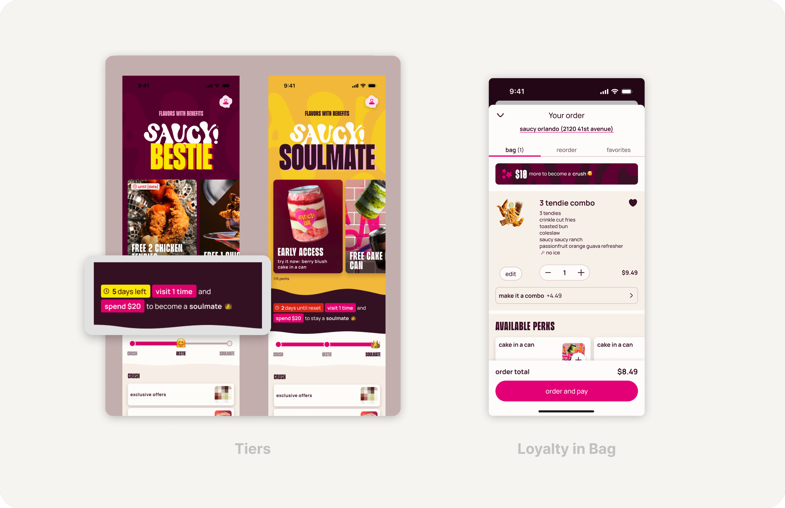
Adding a rewards program and promotions encourages users to repeat purchases and increases brand loyalty.
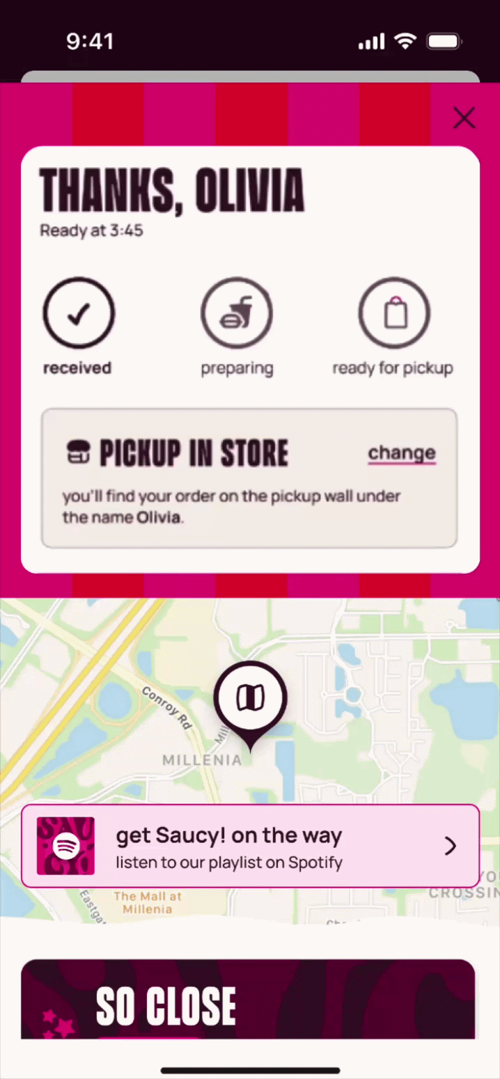
Order Confirmation
A simple-to-understand loyalty experience is presented throughout the user’s journey, encouraging repeat purchases.
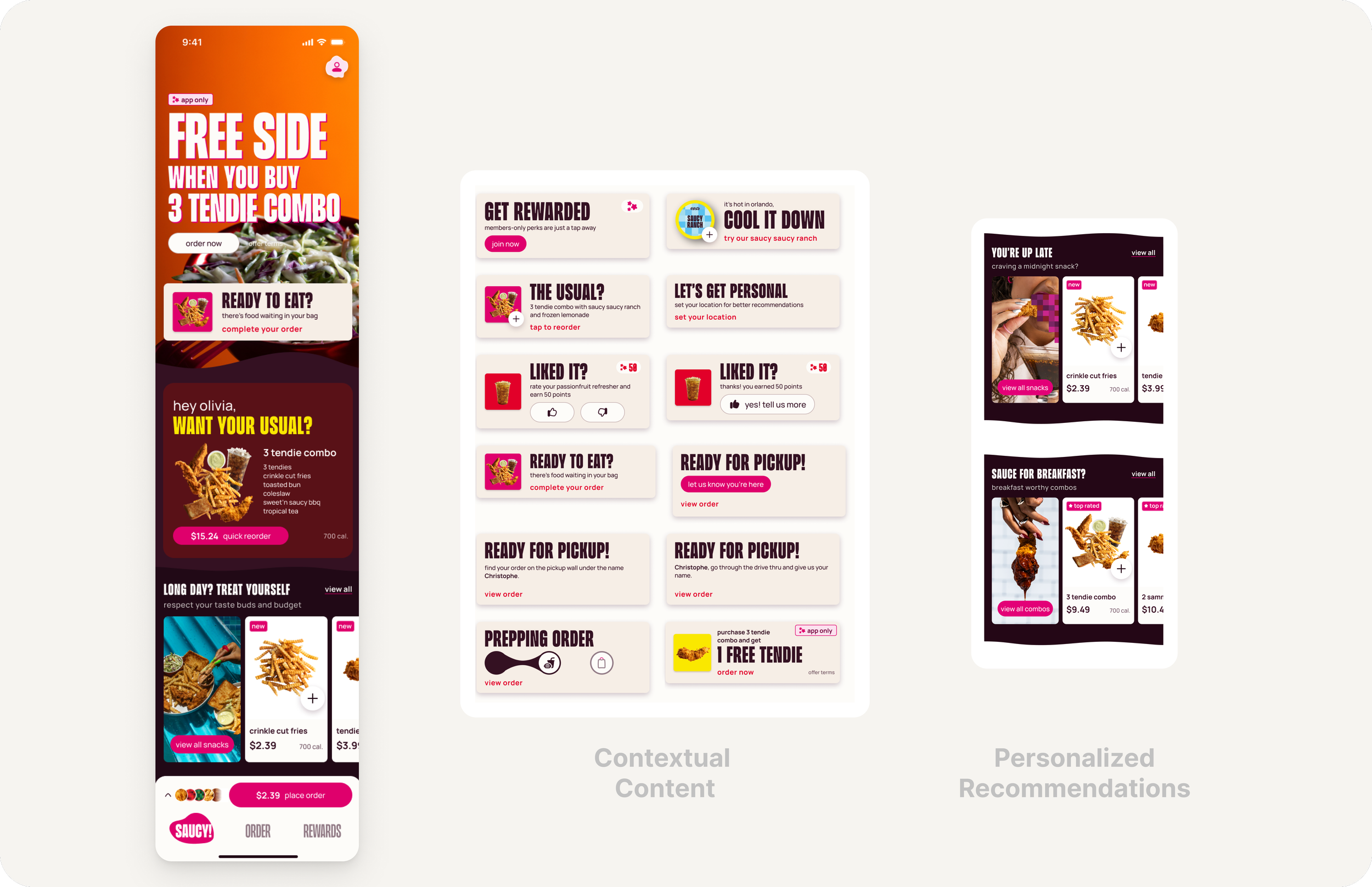
As users engage with the app, more tailored recommendations are presented.
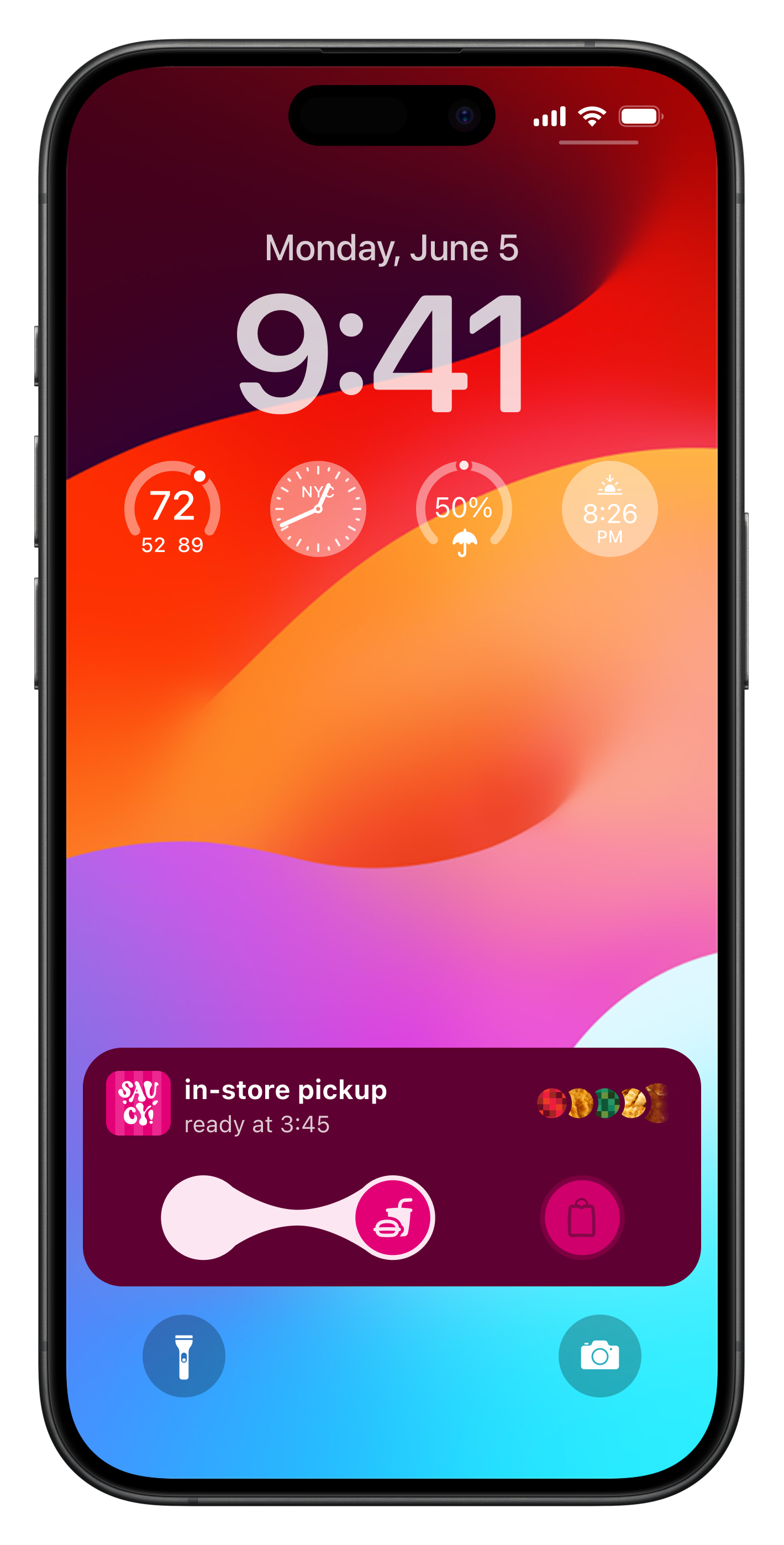
Live Activities
Scaling the Experience
Saucy’s digital experience needed to extend beyond mobile and web into kiosk and drive-thru environments, each with unique constraints around attention, speed, and input methods. Rather than designing one experience and forcing it everywhere, I focused on adapting core patterns to each context.
Larger touch targets and simplified layouts to support distance-based interaction and glanceability
Clear hierarchy and contrast to ensure readability across varied lighting and hardware conditions
Shared system foundations (color, typography, components) and interaction patterns to maintain consistency without duplicating effort
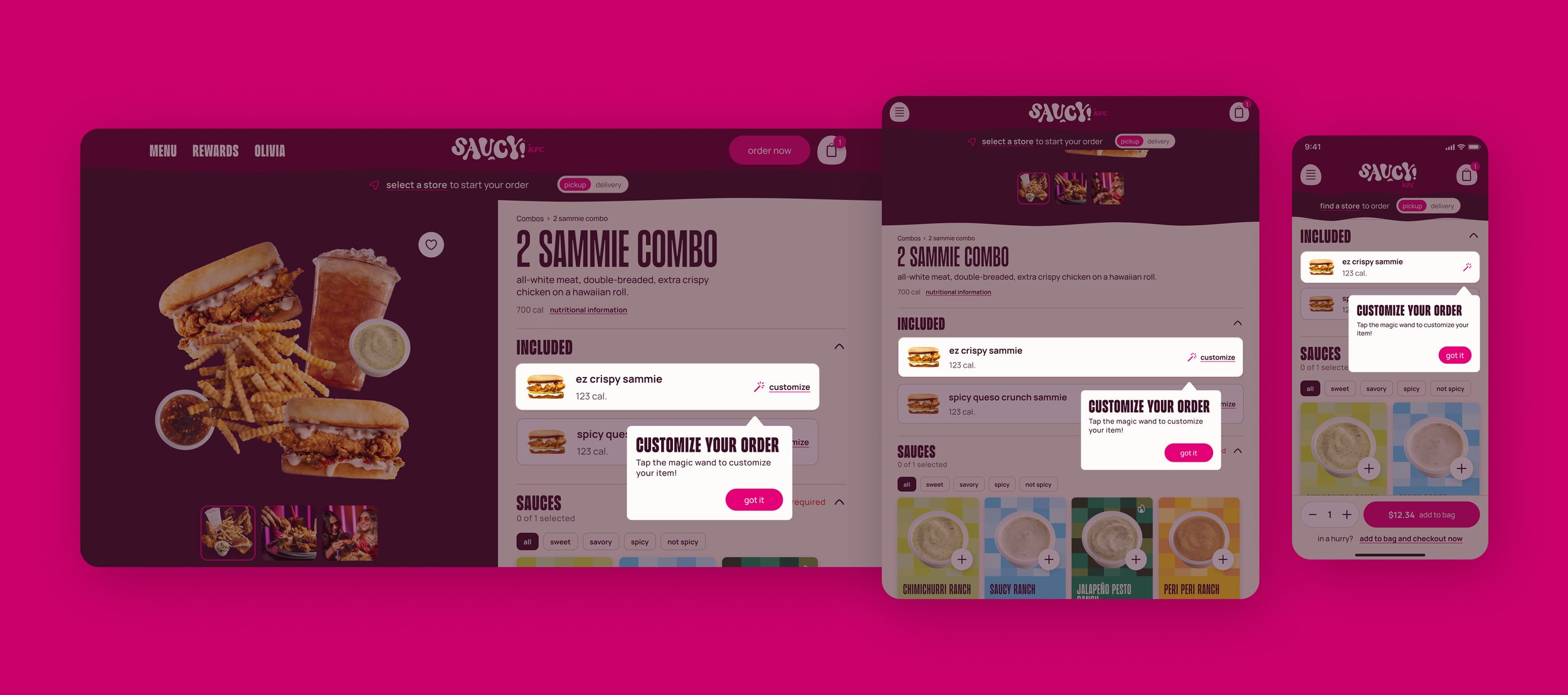
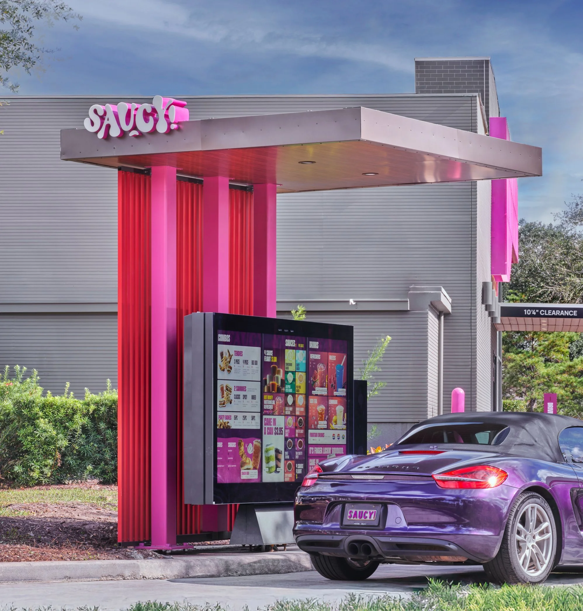
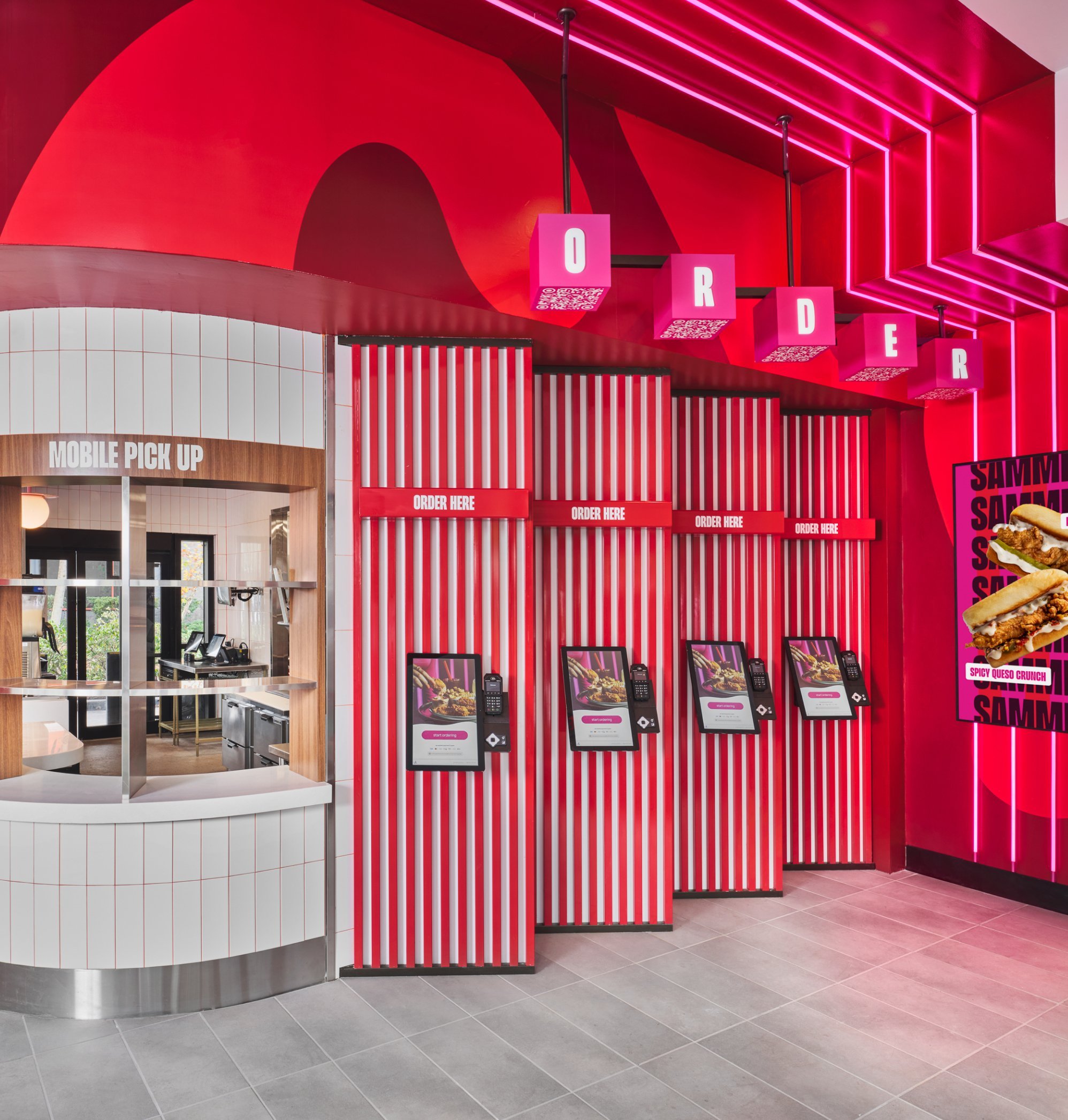
Kiosk
Aside from simply scaling up the UI, it was imperative to work closely with the engineering team to understand the unique technical constraints for kiosk. We worked together to create solutions that felt true to the brand’s identity while still feasible to develop.

Results
“Sales at Saucy locations are more than double the KFC U.S. system average.”
David Gibb, Yum Brands CEO
via FoodOnDemand.com
Reflections
System-first design enables brand scale.
Translating a bold visual identity into a reliable, modular design system ensured consistency across diverse platforms without undermining performance or accessibility.
Cross-platform parity is strategic, not cosmetic.
Thoughtful alignment of patterns across app, web, kiosk, and drive-thru creates trust and reduces friction even when context changes.