Lorna Jane
Active Living
Platform
Progressive Web App
Role
Lead UX/UI Designer
Timeline
3 weeks
Team
UX Research, Brand Stakeholders, Engineering
Lorna Jane is a women’s activewear brand empowering women through movement, confidence, and conscious lifestyle choices. My focus was on optimizing cart and checkout flows to reduce abandonment, improving site navigation to enhance product discoverability, and simplifying product detail pages to facilitate confident purchase decisions.

Goal
Design a clean, simplified site experience supporting a seamless journey from entry to purchase.
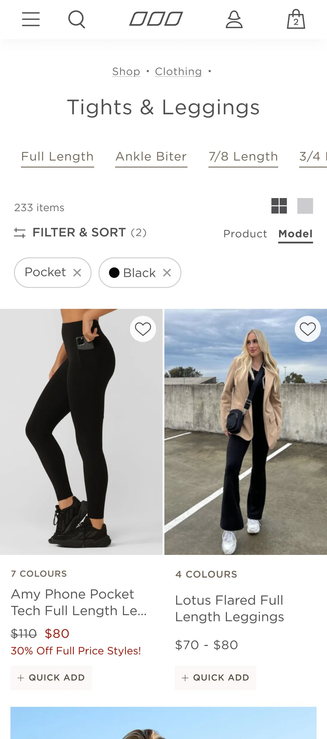
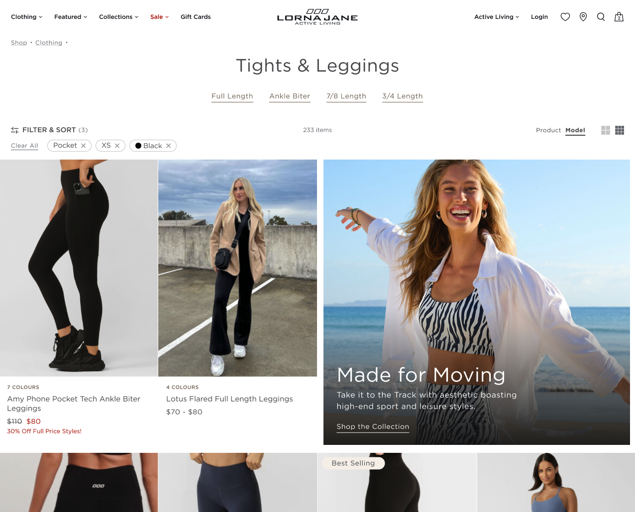
Enhanced Product Seeking
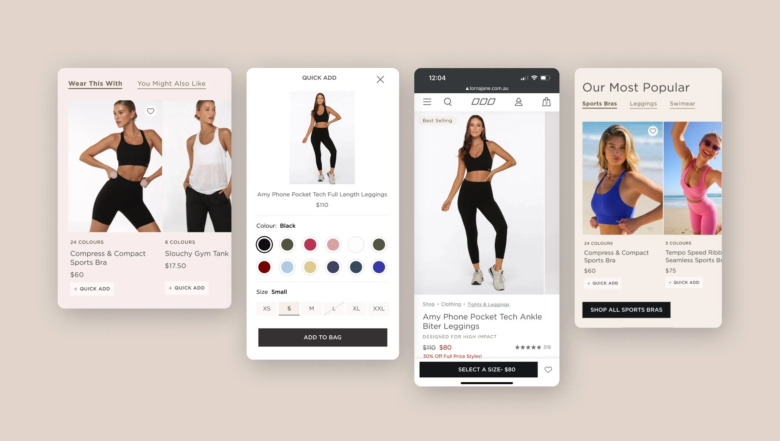
Lorna Jane has product lines that may look the same at first glance to uninitiated customers. What makes these black leggings special? We must guide users to the correct purchase for their needs.
Online-First Retail
Following Lorna Jane’s U.S. physical store closures, the website must communicate their sustainable materials and environmental impact through storytelling and aesthetics.
Simplify Checkout
Simplify product detail pages for a friction-free customer journey and enhance cart, including mini cart to reduce cart abandonment.
Home
The existing home page had a lot of opportunities for improvement. It did not scale well on mobile or do much to introduce new customers to the Lorna Jane brand and its product offerings.
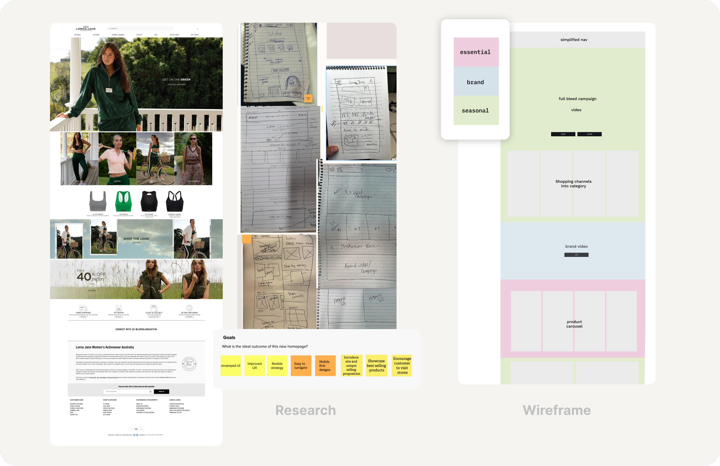
A collaborative workshop with key stakeholders surfaced existing pain points and allowed our teams to align on priorities.
From our workshop I create a wireframe to ensure a variety of content types would be present on the page including campaign highlights/seasonal products, brand awareness and essential products from the catalog.
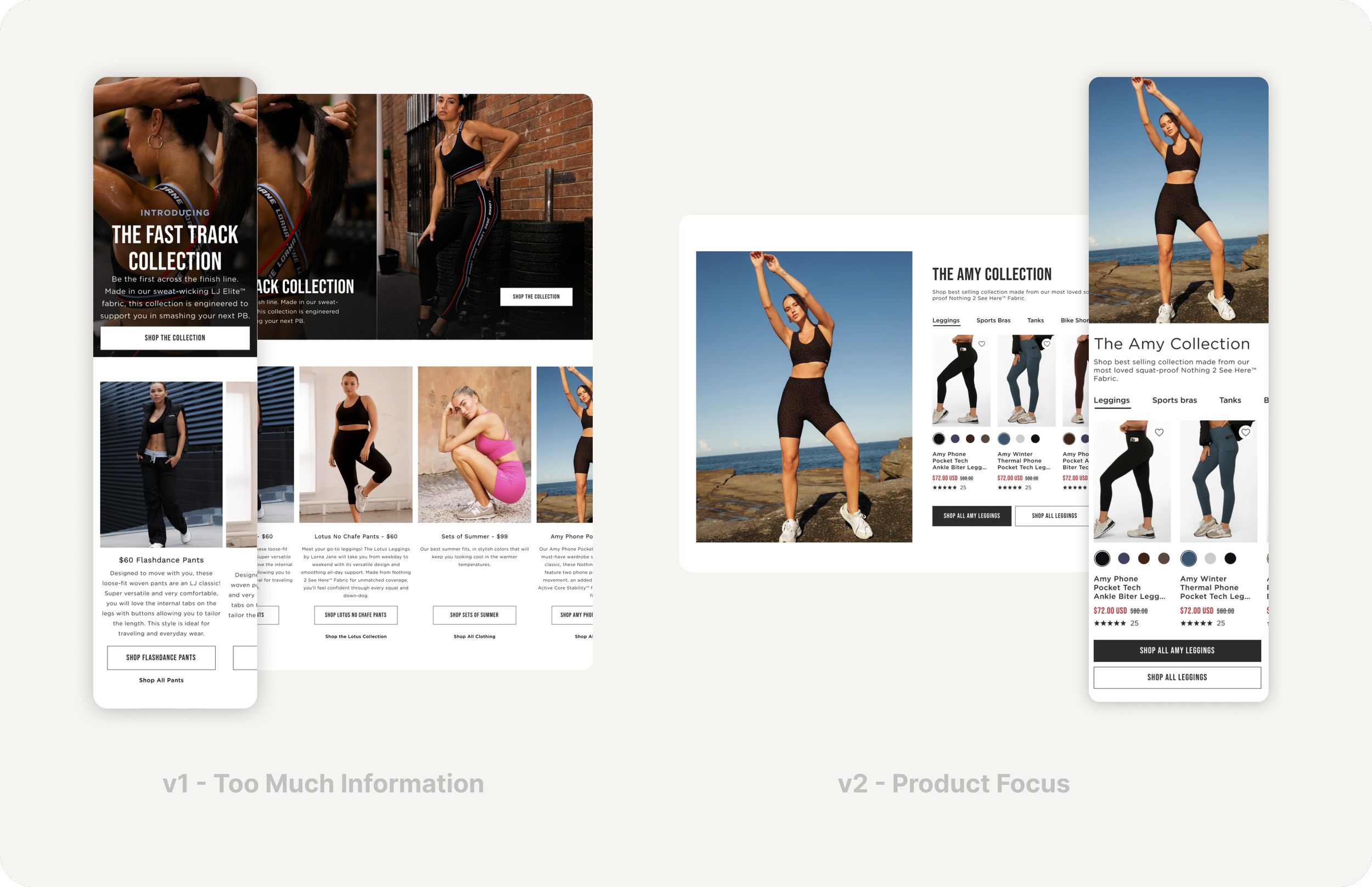
V1 prioritized completeness over clarity by surfacing every collection attribute upfront. This created cognitive overload and buried the path to purchase. V2 tested a product-led hierarchy, reducing content density and introducing direct category entry points.
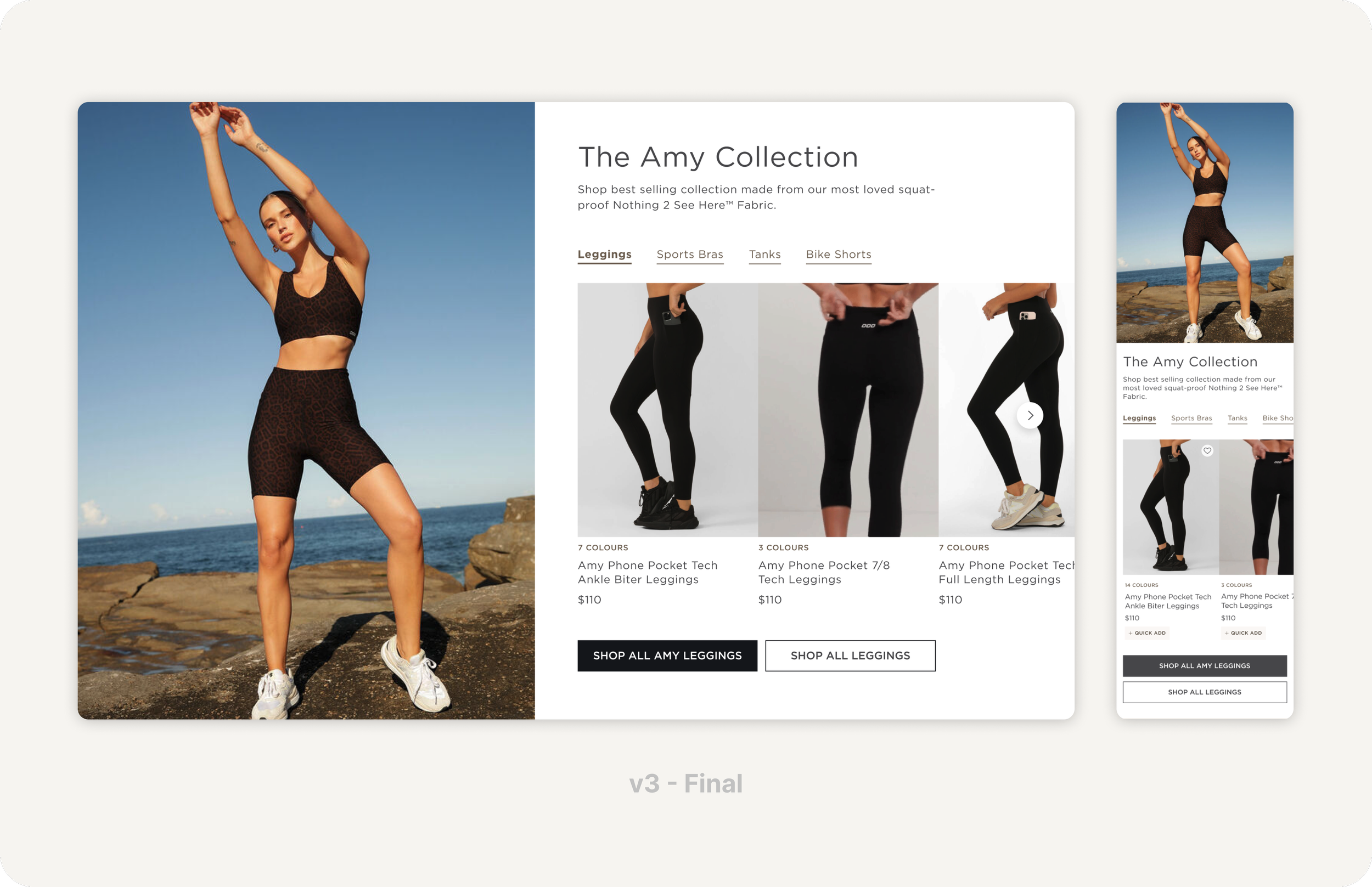
V3 resolved the tension between editorial storytelling and conversion efficiency. The split layout anchors the collection identity through hero imagery while the tabbed product grid reduces decision friction by letting users filter by category without leaving the page.
KPIs
The new site launched in early 2024 to immediate success. The site redesign was successful at eliminating friction, reducing clutter, and simplifying the purchase journey from product discovery through checkout completion.
$11.6M to $21.3M
(FY 2023 → FY 2024) Net profits doubled with online sales contributing significantly.
40.24% bounce rate
This is good for e-commerce. Users are engaged with the content.
6.13 pages per visit
Users are finding paths forward to progress their journeys.
1.1M monthly visits
Visits are primarily (48.9%) from direct traffic to site indicating high brand recognition.
3:35 min session duration
This is above-average for e-commerce. Average ranges from 1-3 minutes.
#9 Category Rank
Ranked in Ecommerce & Shopping - Other (Australia). #35,975 Global rank.
Reflection
Evolution with Intention
A successful website refresh goes beyond visual updates. Real impact happens when aesthetics are paired with improved usability. Strengthening hierarchy, clarifying product information on PDP and PIP and creating a more intuitive path to purchase are crucial for success.