Edible
More Than Just Fruit
Platform
App
Role
Lead UX/UI Designer
Timeline
4 months
Team
UX Research, Brand Stakeholders
Edible is a gifting platform traditionally known for fruit arrangements that has expanded into a broader range of products and experiences. I evolved the app experience to support product expansion, improve discoverability, and encourage new customer behaviors through loyalty engagement and personalization.

Goal
Encourage year-round gifting with a frictionless digital experience
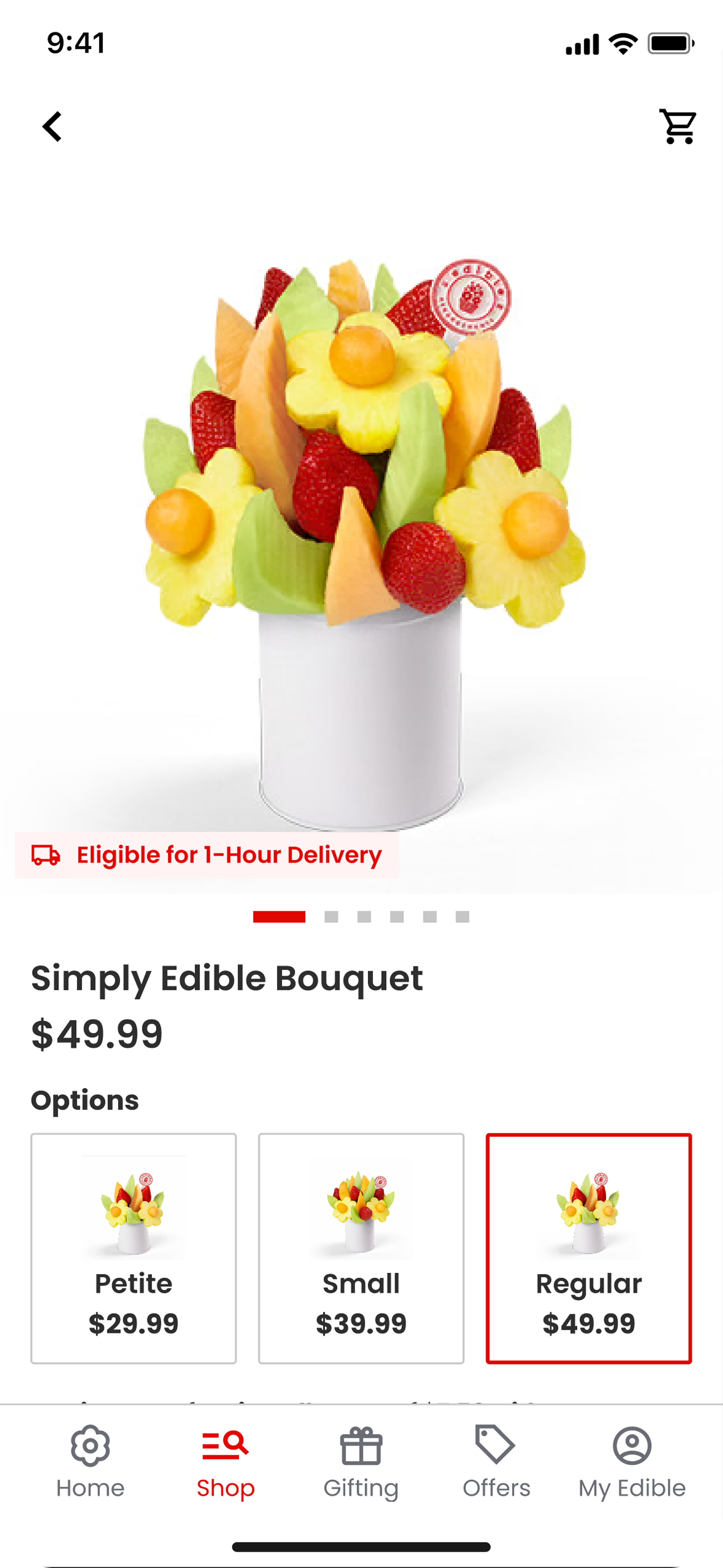
Support Expanded Products
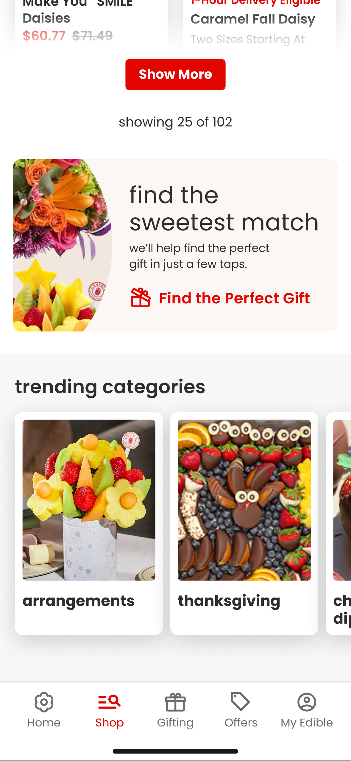
Edible’s expansion into products beyond fruit arrangements called for updated navigation and promotion for these marketplace goods.
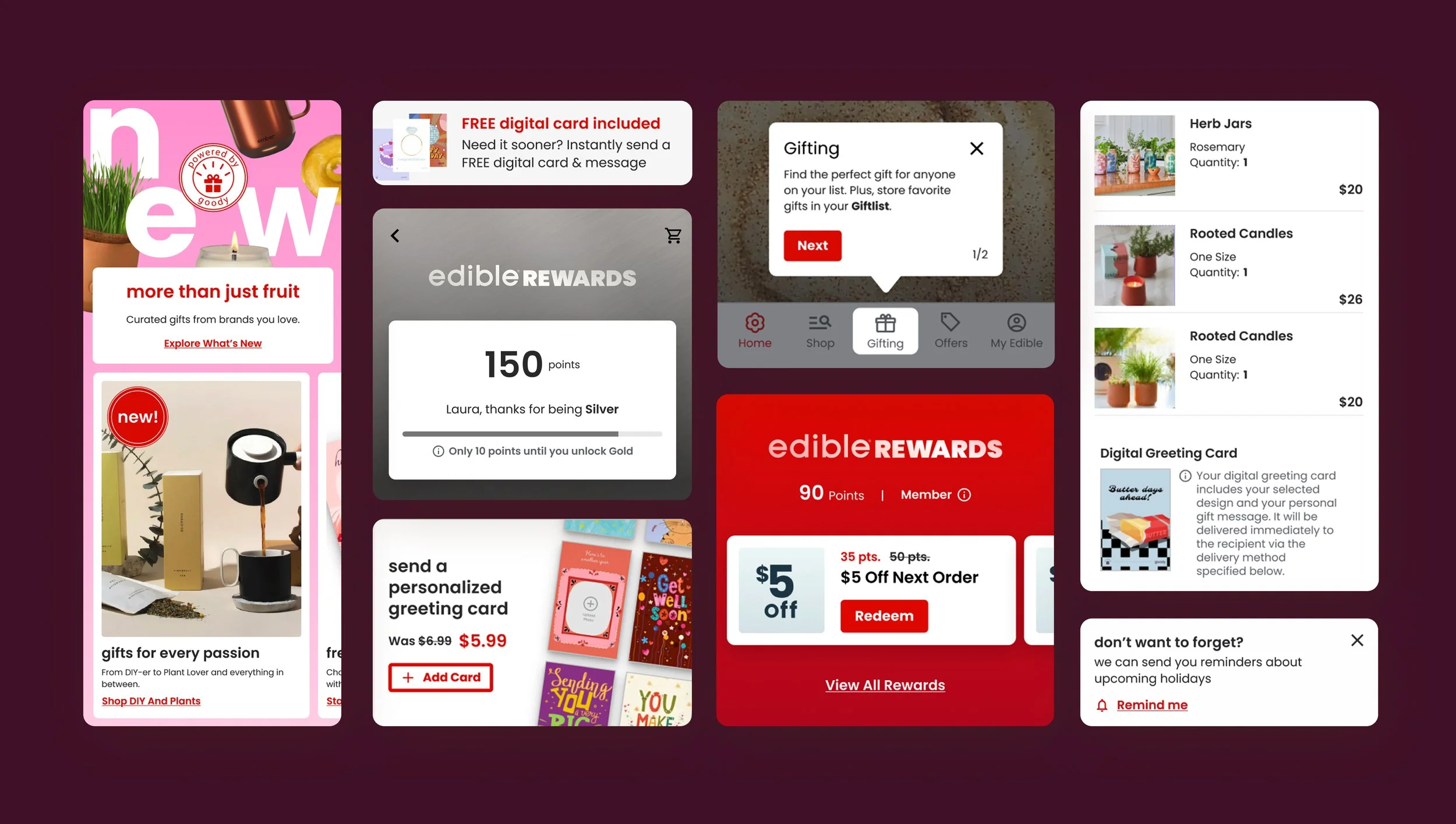
Surface New Loyalty Perks
Their revamped loyalty program needed a design refresh showcasing exclusive offers for recurring customers and encouraging repeat purchases.
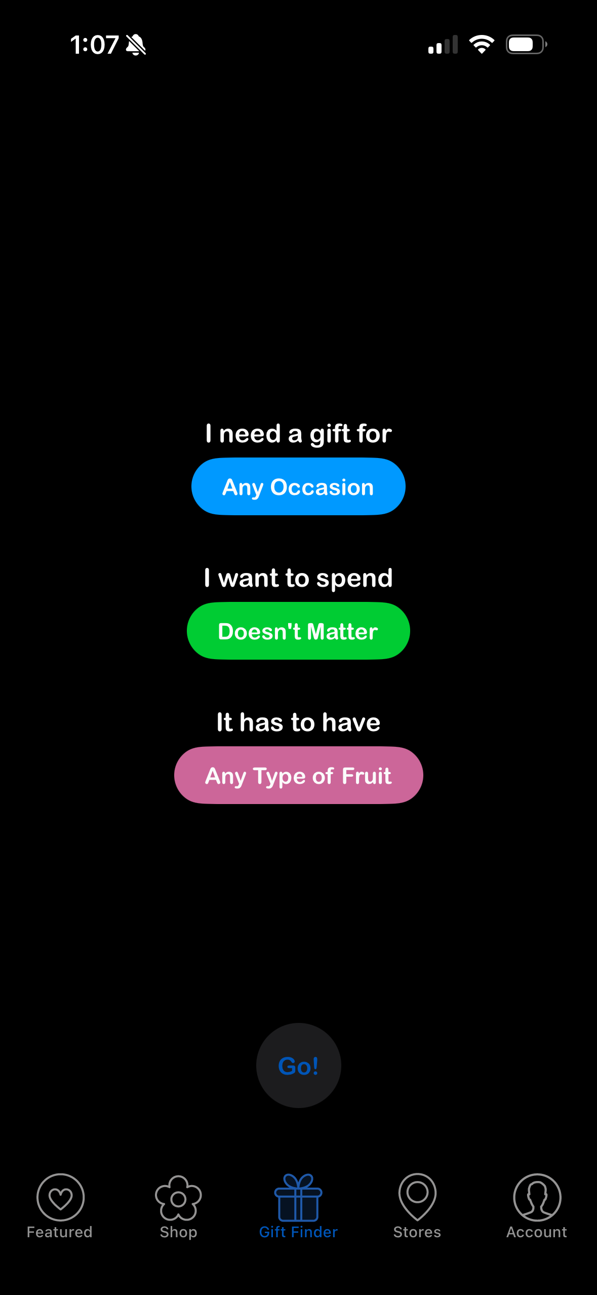
Remind Users To Gift
Edible customers buy 1.2x/year on average. A reminder that there’s something for everyone no matter what time of year it is should boost repeat purchases. Gifts should be easy to find and send in the Edible app.
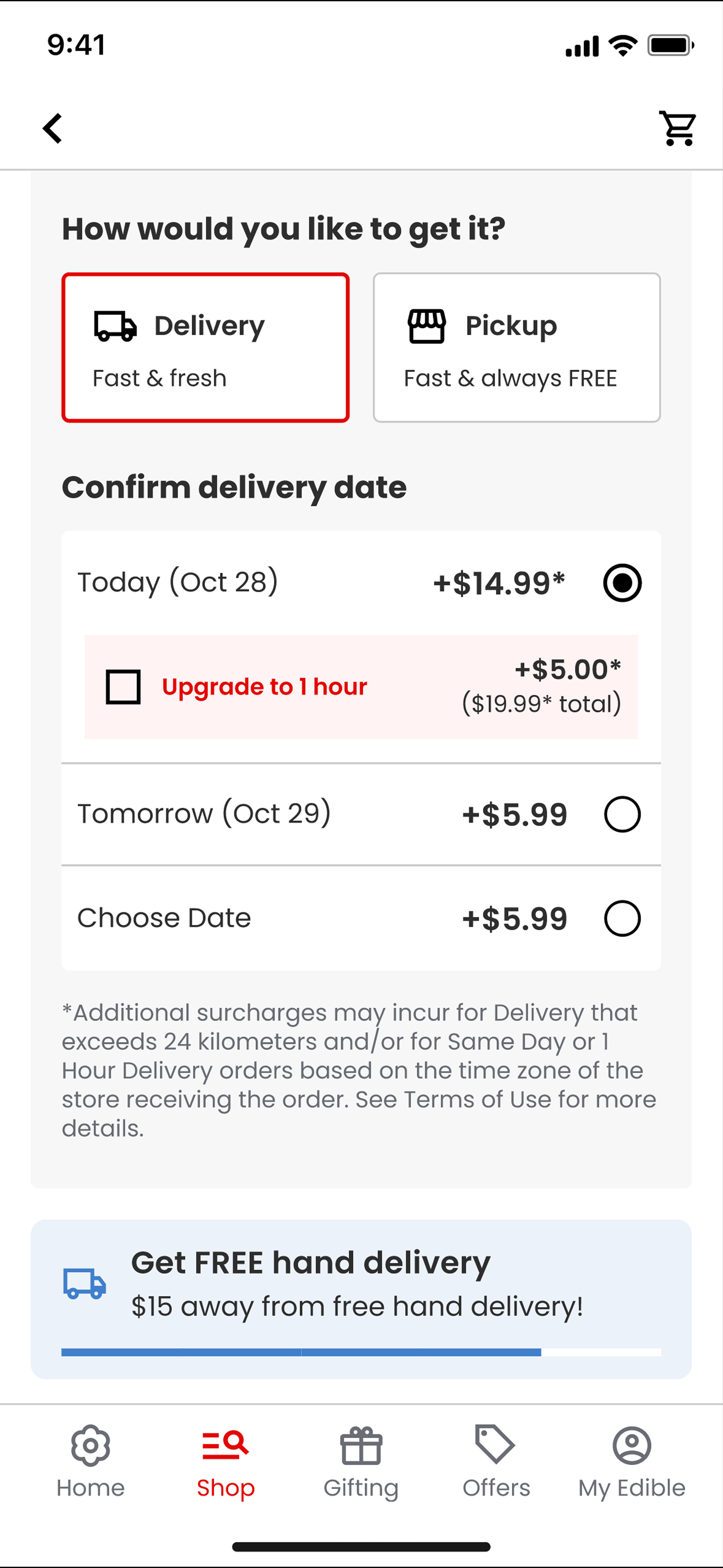
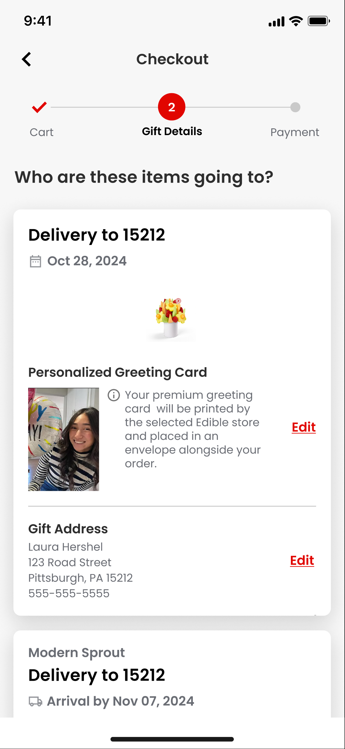
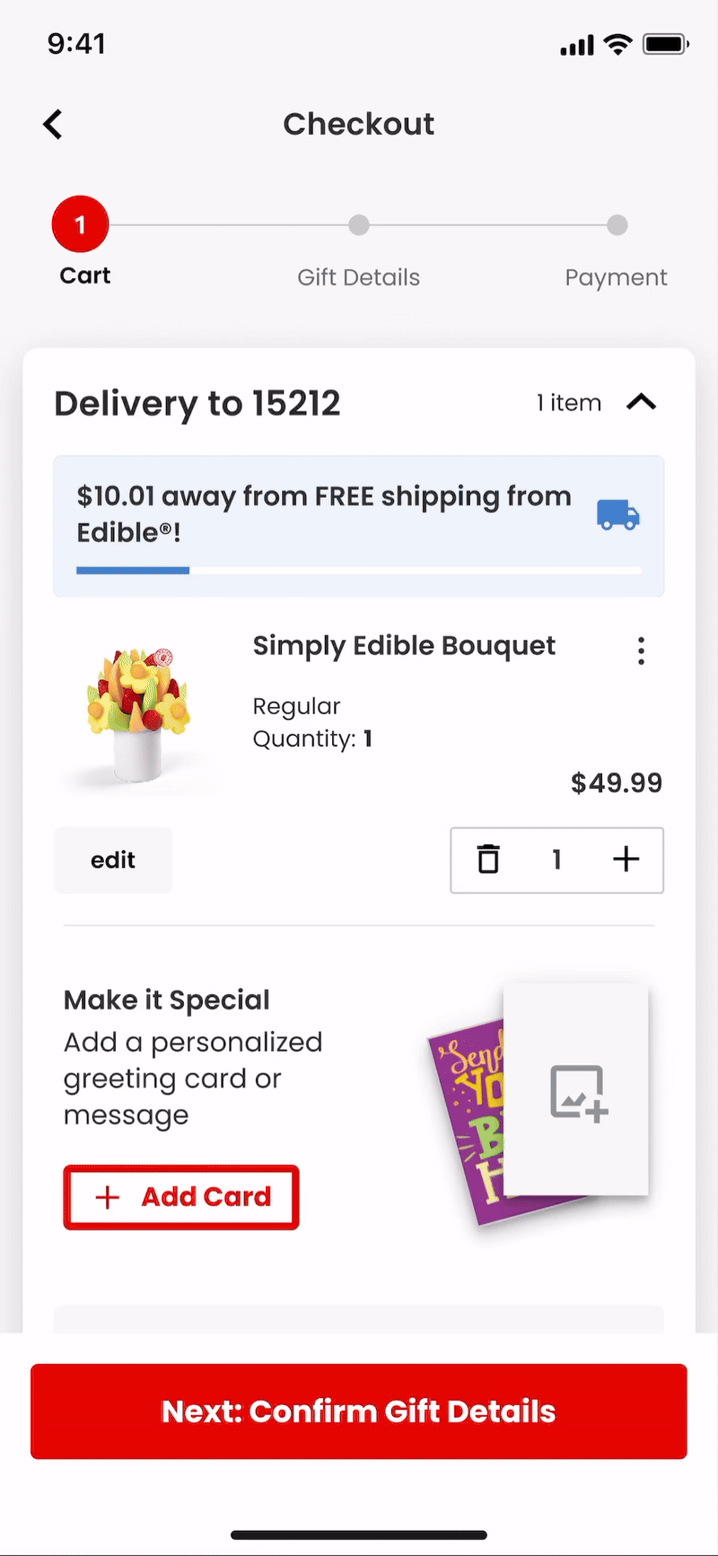
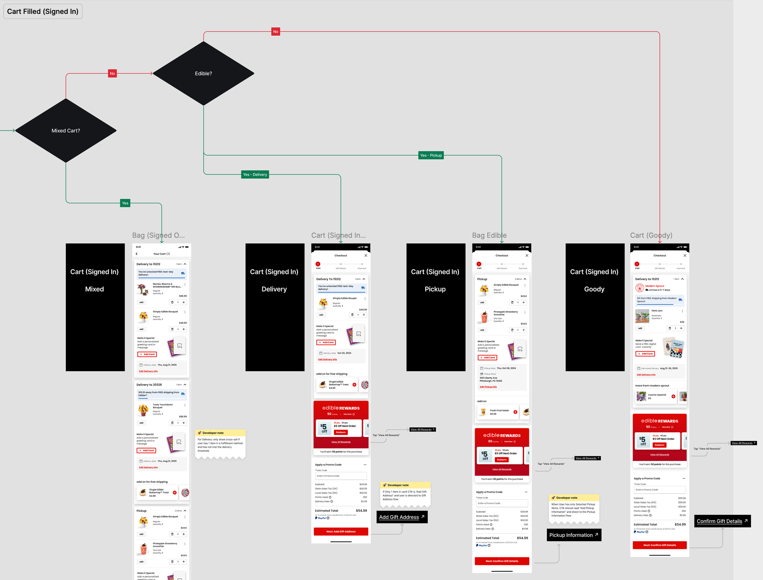
Recipient Info and Cart
Edible’s existing cart allowed for pickup or delivery options, but with the introduction of marketplace products I needed to account for fulfillment from other brands.
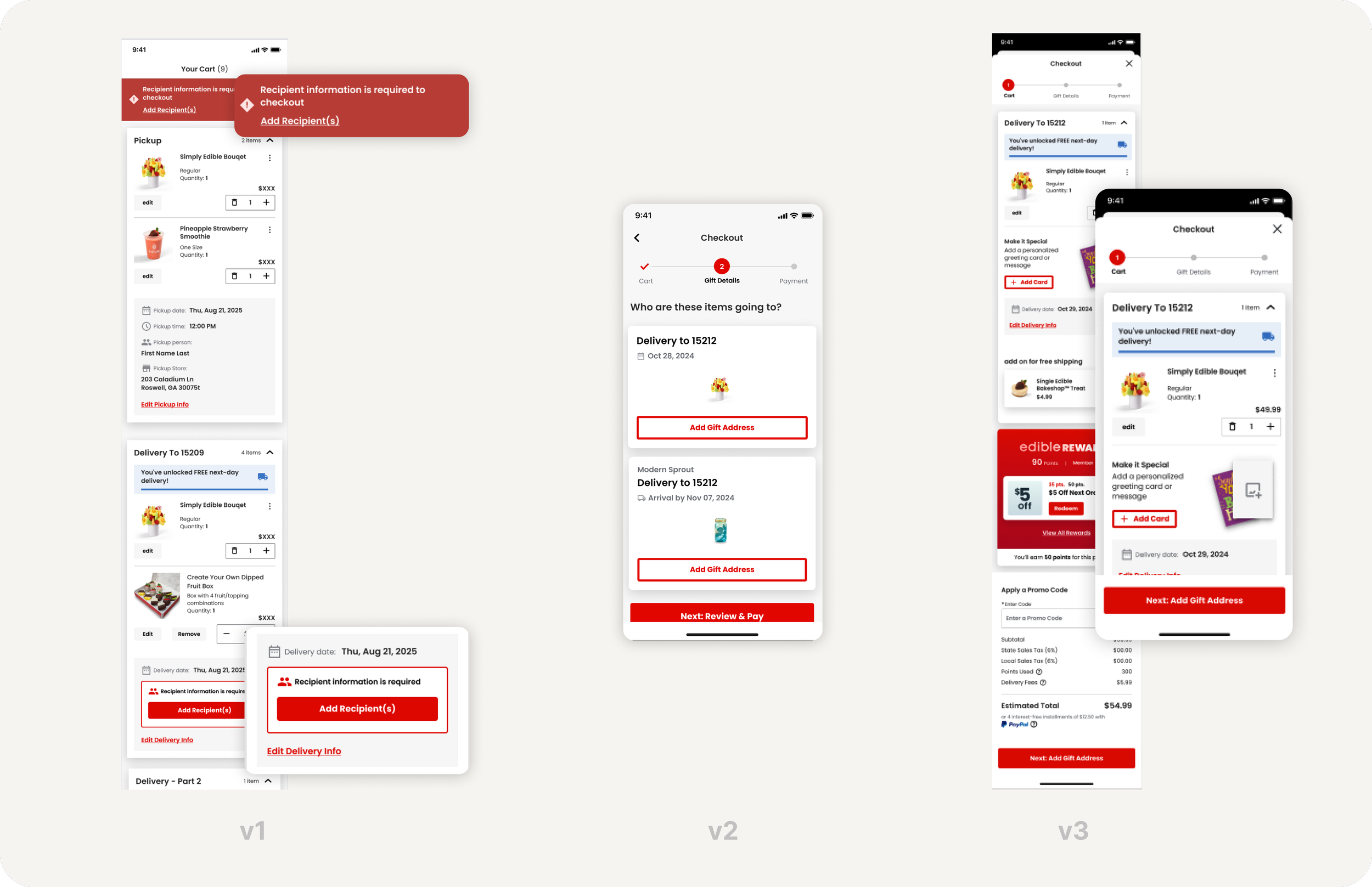
v1 stopped users with an error message and clear area to add recipient information. This felt too antagonistic for such a critical step in the user journey.
A simplified v2 gave users a chance to add their gift address on each fulfillment type, but if users failed to tap the secondary-styled “add gift address” and tried to skip to “review and pay” they would once again be hit with an error message.
v3 allows users to tap into each individual fulfillment but now the sticky CTA “Next: Add Gift Address” directs users to the action they must take before checking out.
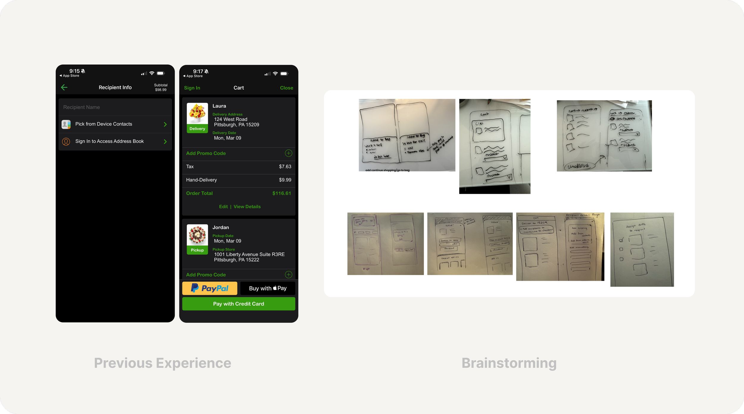
Users were required to add recipient information at the PDP in the previous experience. This caused friction and didn’t allow for users to quickly add to their cart. Once in cart it was difficult to differentiate between different fulfillment types.

Gifting
To arrive at a solution for encouraging gifting, I used a mix of qualitative and quantitative inputs, including existing user behavior and stakeholder insights & business constraints.
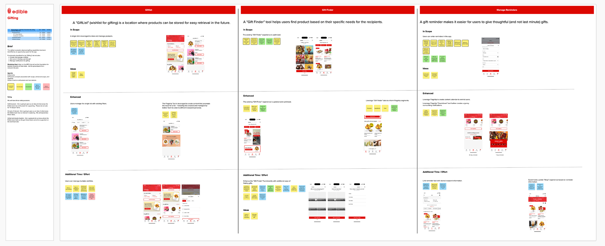
Our team hosted a design workshop with Edible to align all parties on project goals. I also conducted competitive analysis of gifting and loyalty experiences and worked with UX research to determine areas of improvement.
Previous Gifting Tab
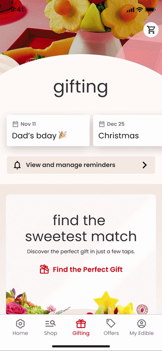
Updated Gifting Tab
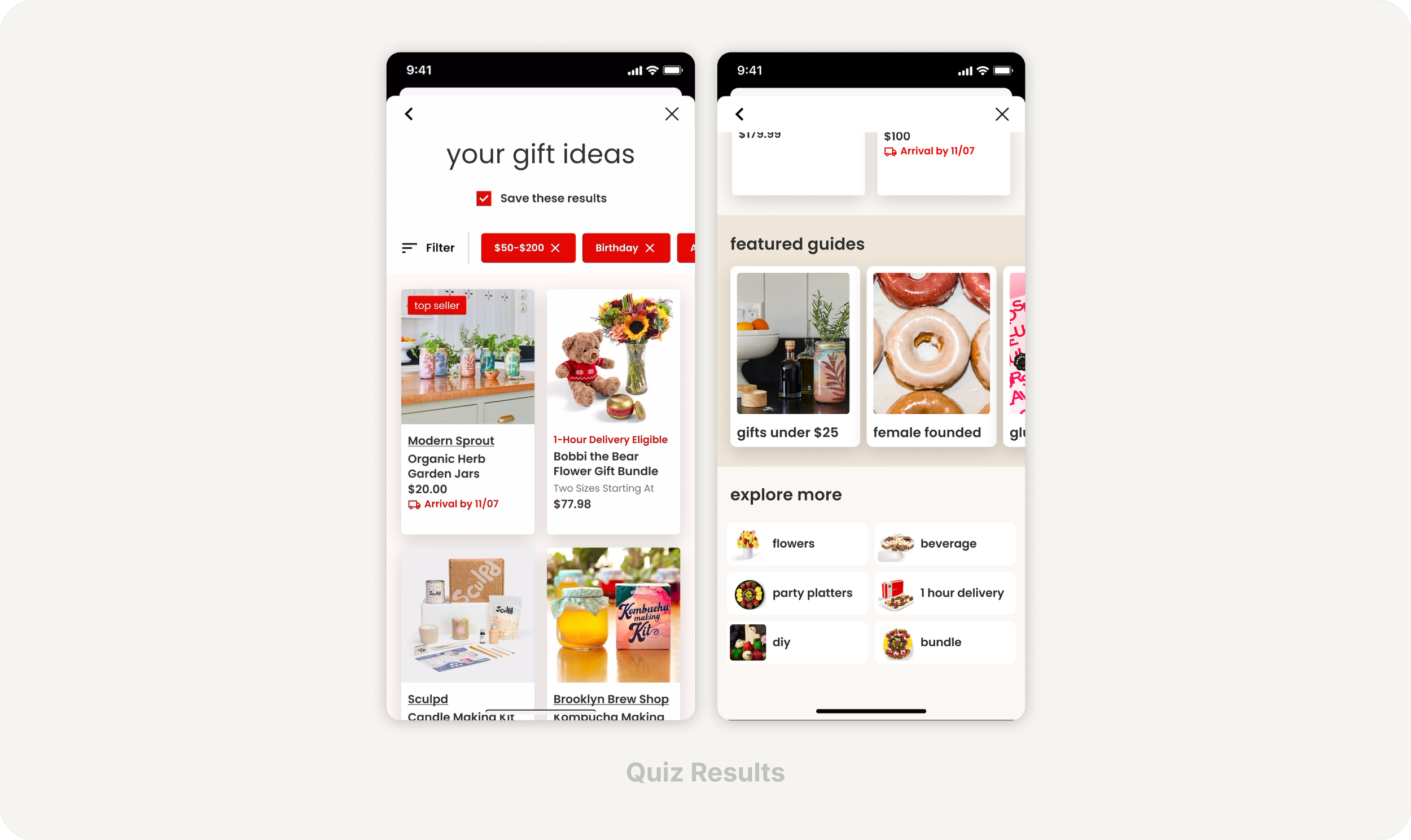
Answers to the quiz are applied as filters that may be removed or edited.
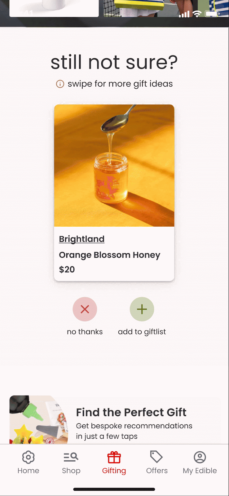
Users have the ability to save their quiz results to their gifting tab to reference again once the gift finder quiz is closed. There are also paths forward including gift guides and promoted categories at the end of the page in case none of the results appeal to the user.
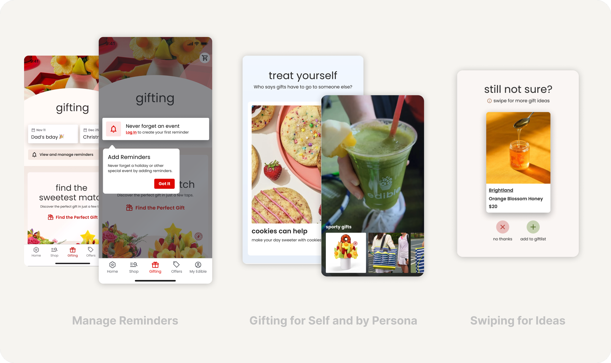
An enhanced Gifting tab with varied content type beyond the quiz gives users more chances to discover relevant content and inject personalization.
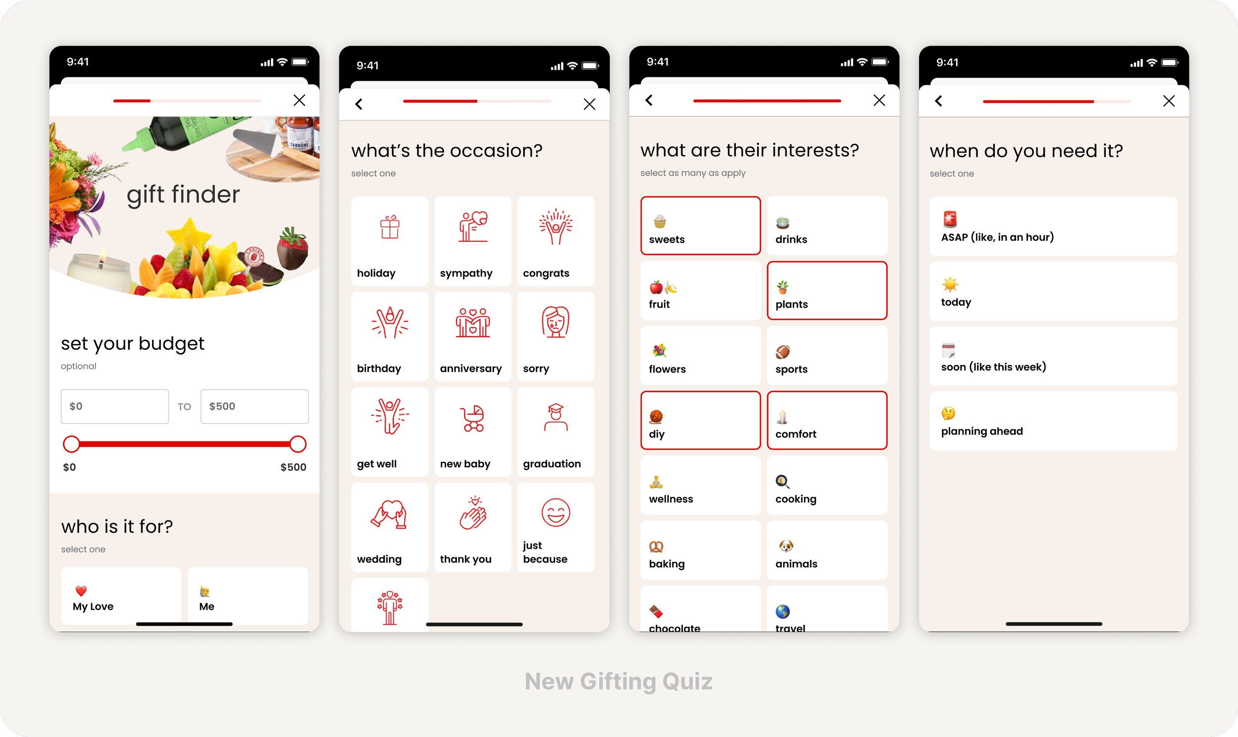
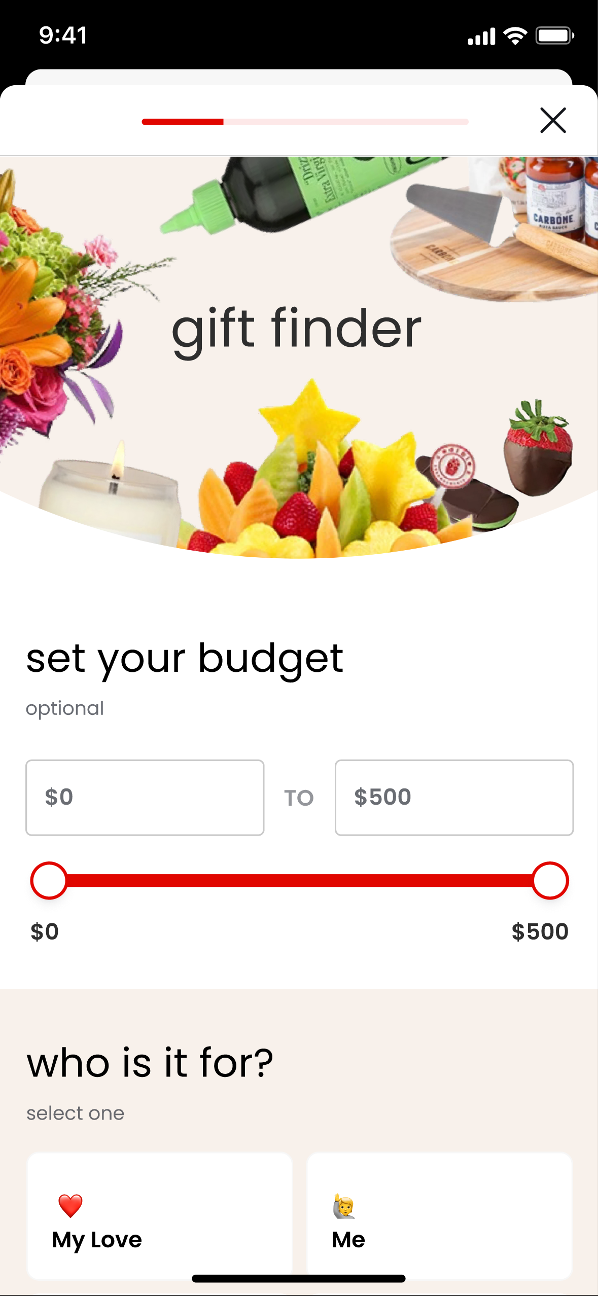
I updated the gift finder quiz with more questions to help narrow the search results. There is also a progress bar to indicate how far into the experience the user is.
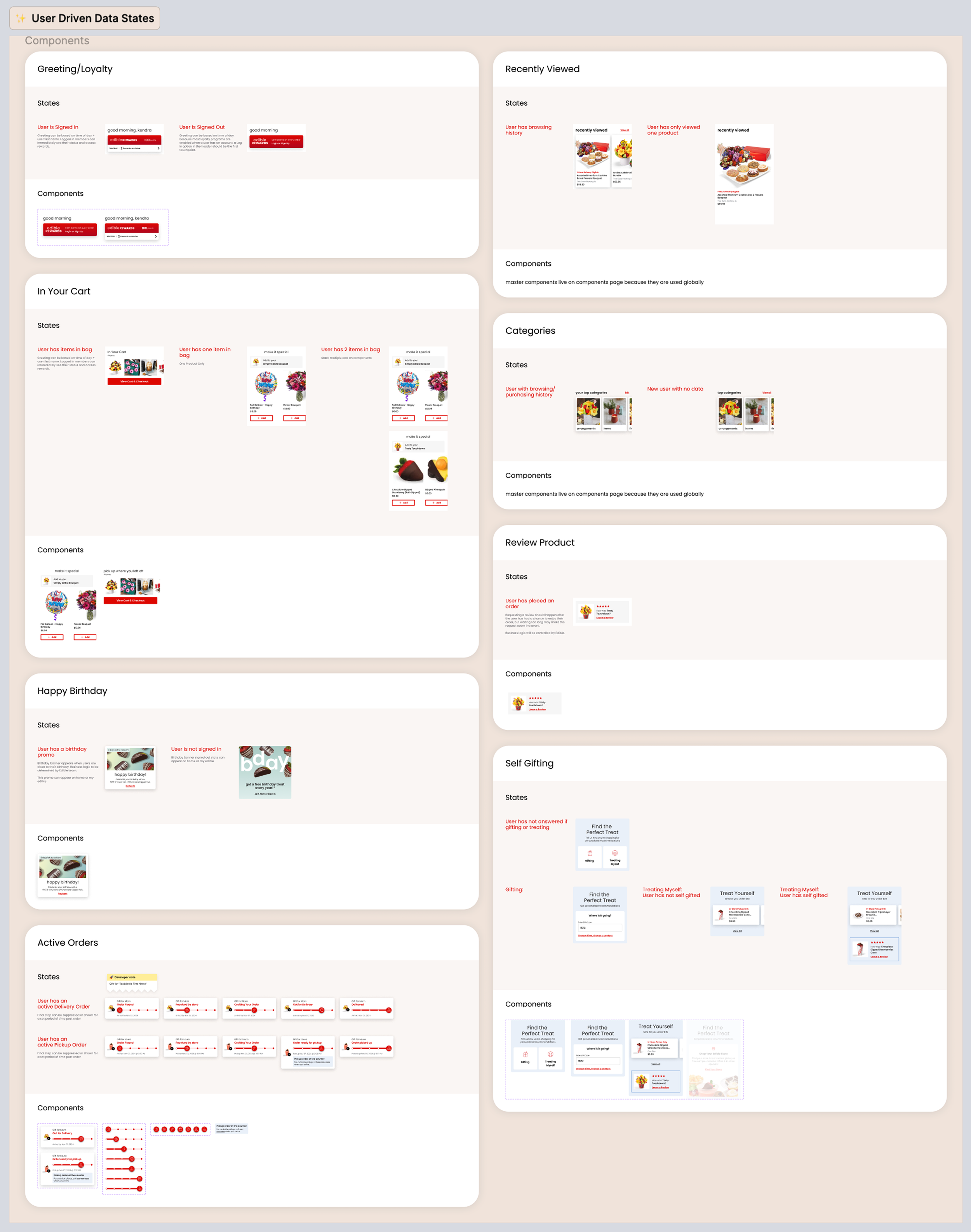
Design System
& Flow Documentation
I handed off a completely new design system that expanded on Edible’s existing branding
Documented how certain components can be segmented to specific user types
Annotated all new flows for user journeys with notes on interactions and areas that should be pulling in dynamic data
Reflections
Brand trust is a design constraint
Expanding Edible beyond its core product required introducing novelty without disrupting existing mental models. Users already trust this brand so it’s important that new features feel cohesive within the existing ecosystem.
Loyalty performs best when embedded
Surfacing loyalty benefits within moments of high intent, rather than as a standalone feature, helped reduce cognitive load and made value feel earned rather than marketed.
Gifting-oriented design supported repeat purchases
Emphasizing occasion-based flows and reminders helps shift behavior from single transactions to recurring engagement tied to meaningful moments.